Visualization - part I
Preamble
lskfjalfksajæloia dsfliadlfiuaspodf SDOIK
In this section we are going to introduce you to how to plot data in R. There are quite a number of plot-lingos in R, here we are going to limit ourselves to the ggplot-lingo. But first we are going to side track a bit.
RStudio projects and orientation
Before we do anything else lets create an RStudio project.
- File -> New project … -> New Directory –> New Project …
- Type in a directory name (e.g. “crfmr-ggplot”)
- Decide where to store the project (read: the directory) on your computer using “Browse …”
- Press “Create Project”
We are going to use a dataset of 190 observations on minke whales in this tutoral. Details on the data and the variables can be obtained here
- Start by opening up a blank R-script: File -> New File -> R Script
- Then copy the code below into the script
- Pass each line to the console (cntr-enter or press the “Run”-button)
library(tidyverse)
w <- read_csv(file = "ftp://ftp.hafro.is/pub/data/csv/minke.csv")
w          # print out the data in the console
# the view is limited to the first few variables and
# 10 observations
glimpse(w) # get a "side" view in the console, gives you a view of
# all the variables
view(w)    # opens up a separate view of the data
If you want to keep a local copy of the minke-dataset (e.g. for later use) you can save it on your computer via the write_csv-function (add this to your script):
write_csv(w, file = "minke-copy.csv")Once done, one can then read the data in from the local computer via:
my_minke <- read_csv("minke-copy.csv")- Save your script, e.g. as “minke-data.R”
We are going to deal with data import in more detail later in the course. For those wanting to get ahead, read r4ds - Import.
Open your File Explorer (Windose) and try to browse to the directory containing “minke-copy.csv” and “minke-data.R”
Creating a ggplot
Our first objective is to learn how to generate this type of a graph:

Plot key components
ggplot has three key components:
data, this must be a
data.frameA set of aesthetic mappings (
aes) between variables in the data and visual properties, andAt least one
layerwhich describes how to render each observation.
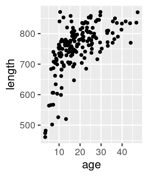
We always start a plot creation by calling ggplot.
- Copy the code below and put it at the end of the script you already started above.
- Pass each line to the console (cntr-enter or press the “Run”-button)
ggplot(data = w,
       mapping = aes(x = age, y = length)) +
  geom_point()
Take note of the “Warning message” that appears in your console once you have run the script.
Warning message:
Removed 17 rows containing missing values (`geom_point()`).
This tells us that there are 17 observations were either age or length or both are missing and thus not plotted.
It is important that you observe closely the warning messages that appear in your console when you are running any scripts. Some of them are just informative like the one above, but other message can be more critical with respect the excecution of the code. As an example when runing this code:
ggplot(data = w2,
       mapping = aes(x = age, y = length)) +
  geom_point()
gives us this warning:
Error in ggplot(data = w2, mapping = aes(x = age, y = length)) :
object 'w2' not found
At the beginning you are going to stumble accross plenty of error message associated with your code. Such stumblings are expected and part of the process of learning R.
The above code is actually composed of different element that are build on top of each other:
# A blank canvas
ggplot(data = w)
# Add (map) what will be on x and y axis
ggplot(data = w,
       mapping = aes(x = age, y = length))
# Add point layer
ggplot(data = w,
       mapping = aes(x = age, y = length)) +
  geom_point()
Different syntax, equivalent outcome:
ggplot(data = w, mapping = aes(age, length)) + geom_point()
ggplot()                    + geom_point(data = w, mapping = aes(age, length))
ggplot(data = w)            + geom_point(mapping = aes(x = age, y = length))
ggplot(w)                   + geom_point(aes(age, length))
We have not yet managed to emulate the plot shown at the beginning. We can add the sex of the minke by using colour, … and add add a “loess”-smoother layer via geom_smooth:
ggplot(w,
       aes(age, length, colour = sex)) +
  geom_point()
# ... add a loess-smoother
ggplot(w,
       aes(age, length, colour = sex)) +
  geom_point() +
  geom_smooth()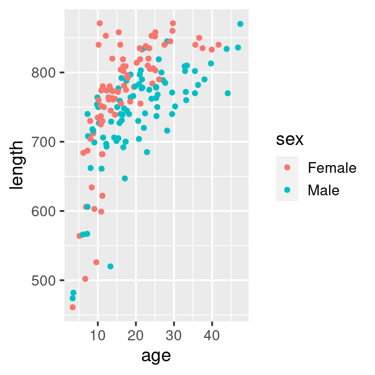
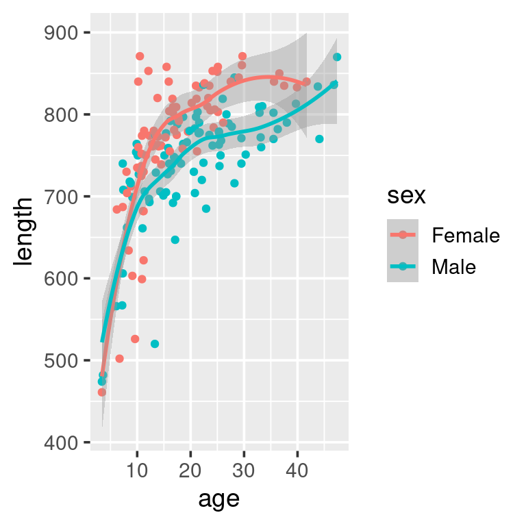
As a data-exploration exercise this plot should suffice. But if we were to e.g. put this figure into a report to be read by others we may want to add nicer labels, possibly using other colours, in addition to some auxillary informations:
ggplot(w, aes(age, length, colour = sex)) +
  geom_point() +
  geom_smooth() +
  labs(x = "Age [year]",
       y = "Length [cm]",
       colour = "Sex",
       title = "Minke whale",
       subtitle = "Age and length by sex",
       caption = "Data from Iceland") +
  scale_colour_brewer(palette = "Set1")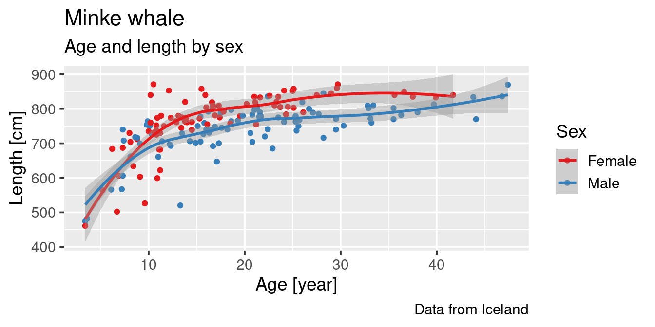
Distributions
A histogram that shows the distribution of the data can be generated by using geom_histogram:
ggplot(w) +
  geom_histogram(aes(length),
                 binwidth = 30)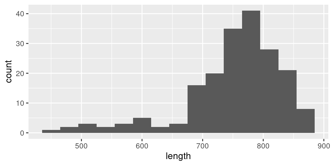
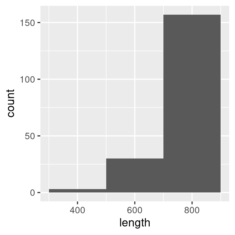
We see that the data are distributed to the right, with relatively few observations of whales less than ~7 meters. The binwidth above is set to 30 [cm]. What binwidth is used is a users preference, but below are examples of two extremes, both wich are less informative than the one above:
ggplot(w) +
  geom_histogram(aes(length),
                 binwidth = 5)
ggplot(w) +
  geom_histogram(aes(length),
                 binwidth = 200)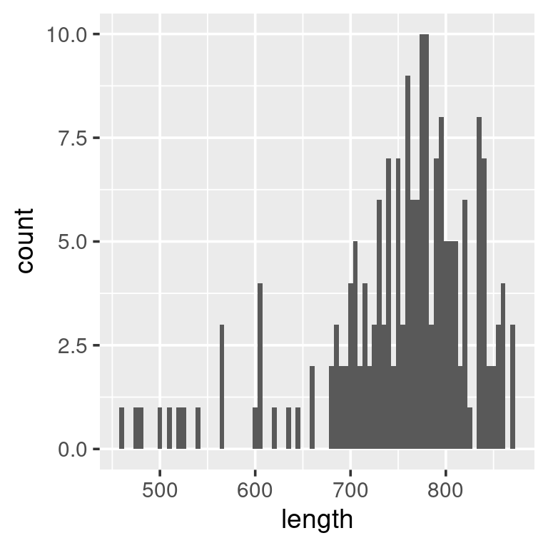
A geom_boxplot allows us to get a broader idea of distributions, particularly when comparing different categories:
ggplot(w,
       aes(x = sex, y = length)) +
  geom_boxplot()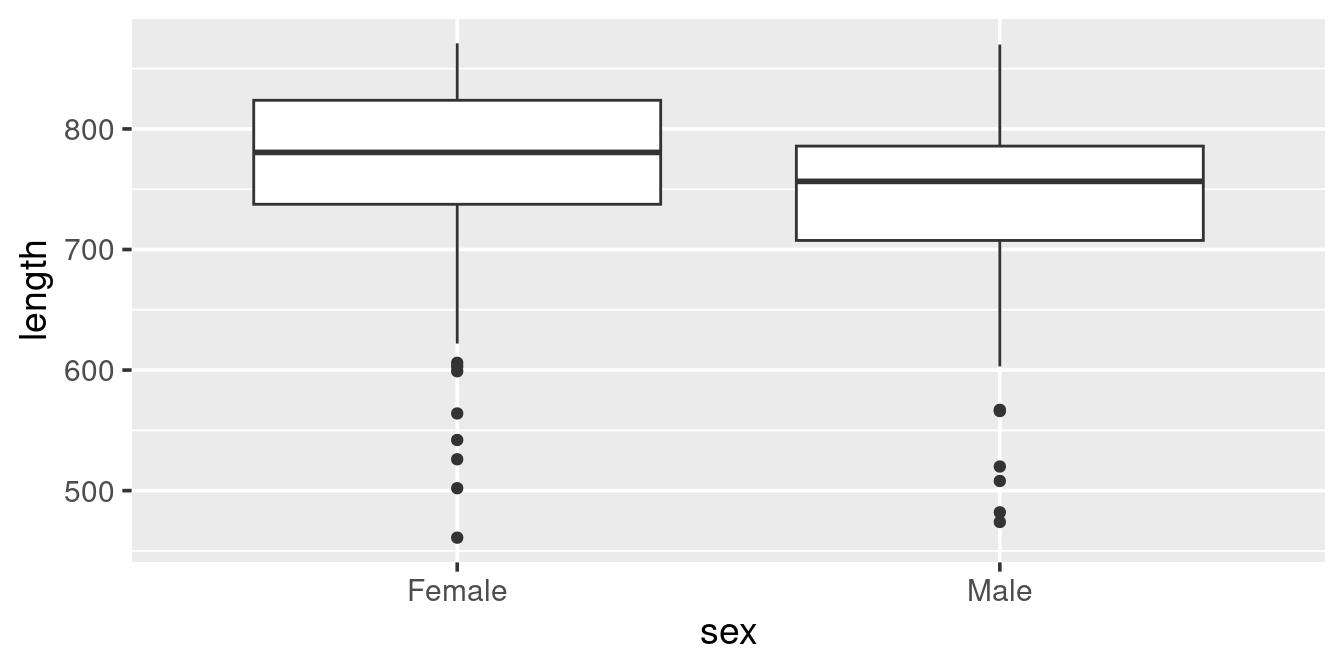
Here we see that Females in the sample are generally larger than the Males (as we saw also in the scatterplot) and that “outliers” are in the lower length range of the data (as indicated in the histogram above).
We can actually create a different vision of the distribution using geom_violin
ggplot(w,
       aes(x = sex, y = length)) +
  geom_violin()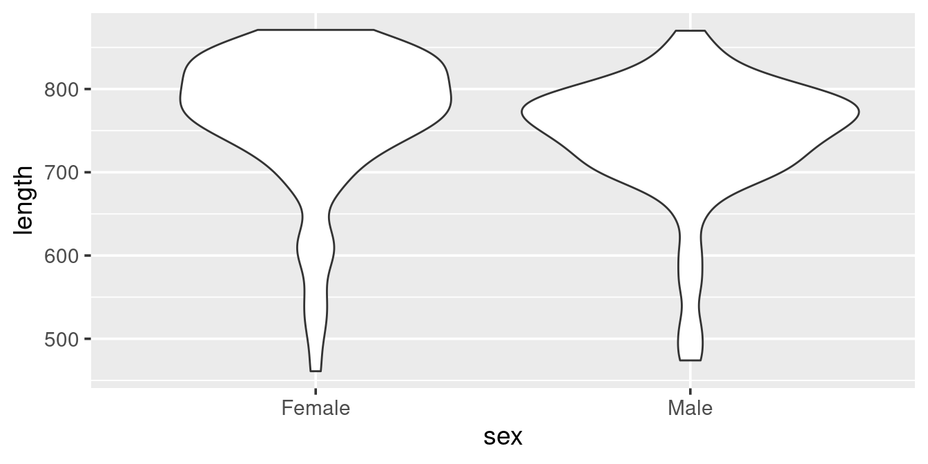
The violin plot is actually a “density” histogram. The information in the above graph could also be presented as:
ggplot(w,
       aes(x = length)) +
  geom_density()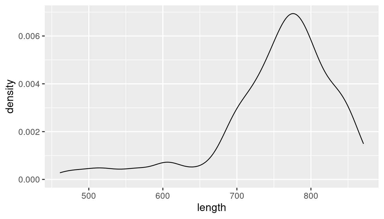
The above plot shows the density distribution of all whales. Given the example of the use of “colour” in the scatterplot example try to modify this code:
ggplot(w,
       aes(x = length)) +
  geom_density()
such that it gives this representation of the data:
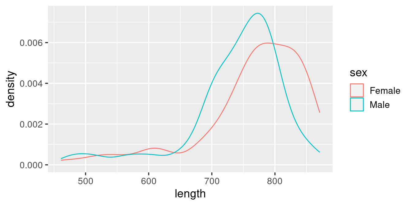
ggplot(w,
       aes(x = length, colour = sex)) +
  geom_density()
Facets
One of the power of ggplot is that you can split the plot up based on some (categorical) varibles in your data by using geom_facet. Take e.g. this histogram plot, where we have used “fill” (rather than “colour”) to separte out the sexes:
ggplot(w,
       aes(length, fill = sex)) +
  geom_histogram()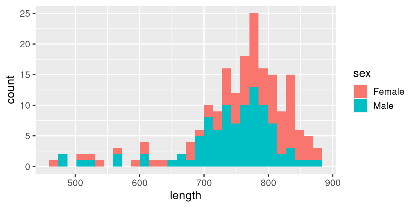
This histogram is diffult to “read”, particularily when it comes to the Females (because they are plotted on top of the Males). Here we can resort to splitting up the plot into facets based on sex:
ggplot(w,
       aes(length, fill = sex)) +
  geom_histogram() +
  facet_wrap(. ~ sex)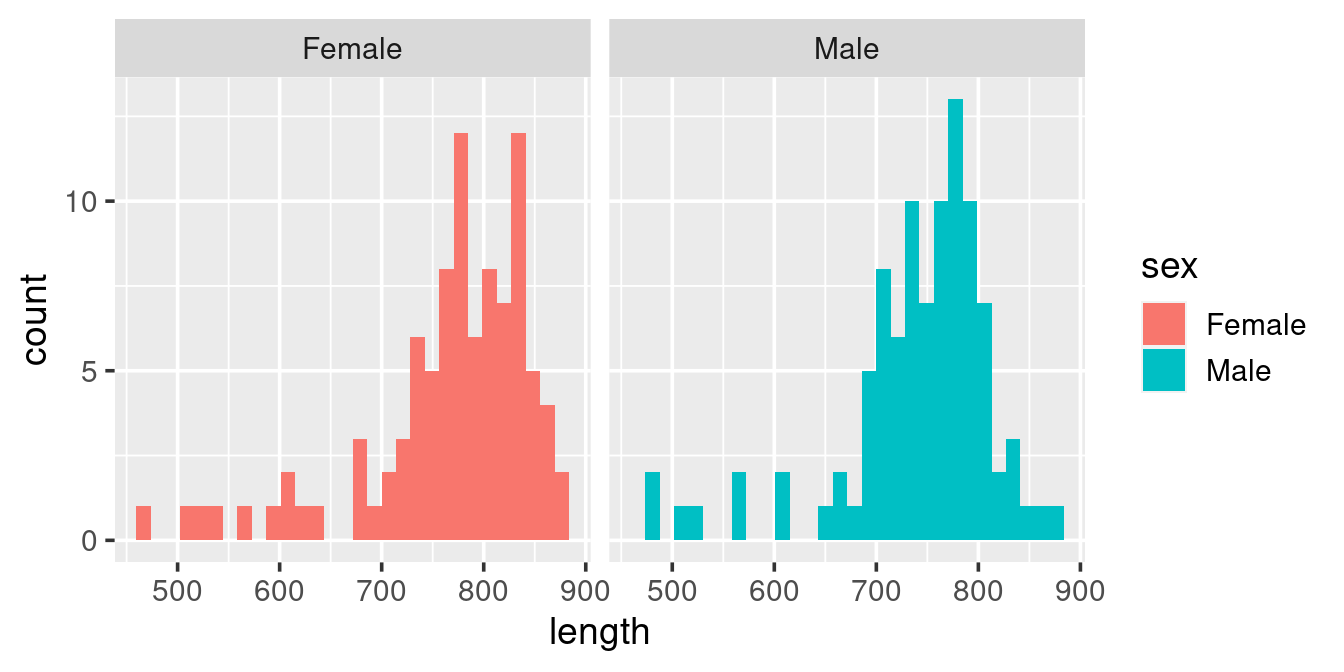
The above graph has two problems:
- The use of colour to distinguish sex (here via “fill”) is redundant because that is already indicated by the facets.
- A comparison of the length frequency distribution between the sexes is difficult because the panels are side-by-side rather than one on top of one another.
Modify the graph such that you get this visual:
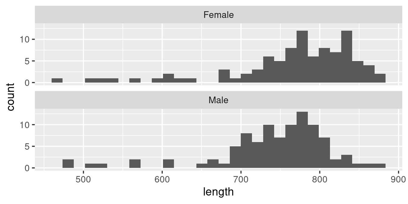
Read on the help for facet_wrap (type ?facet_wrap in the console) to try to find how to get the layout so that graphs are on top of each other.
ggplot(w,
       aes(length)) +
  geom_histogram() +
  facet_wrap(. ~ sex,
             ncol = 1)
Saving you plot
Your objective with creating a graph is to use it as a part of your communication with others. There are two ways to export graphs out of RStudio.
- A simple copy-paste:
- In the “Plots” pane click on “Export” -> “Copy to Clipboard …”.
- Adjust the dimentions to your liking and then right-click
- Paste this into your favourite commication medium
- Use the
ggsaveto save your active graph: -
ggsave(filename = "minke-plot.png")Check the help file for ggsave to explore the options you have when saving a plot.
A “spatial” plot
The minke dataset has coordinates. If you are map enthusiast (like me) you may want to get a spatial representation of the location of each observation.
Given what you have learned above, try to emulate this scatterplot:
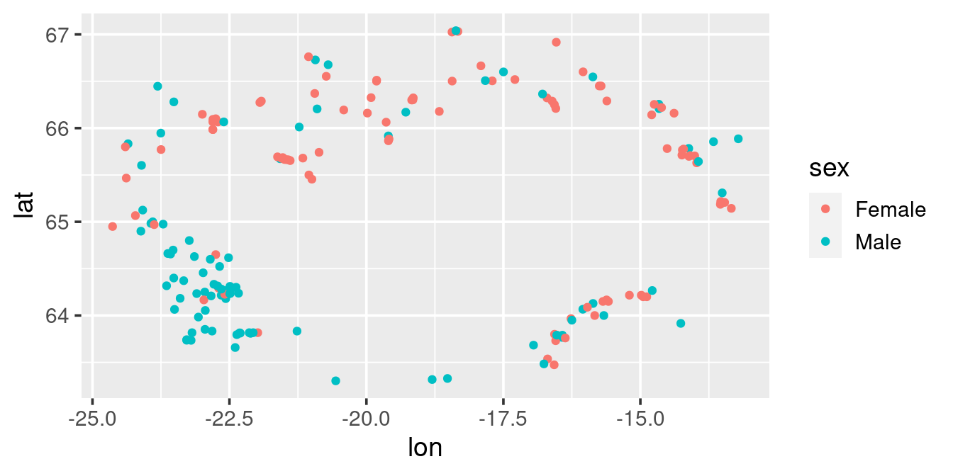
ggplot(w, ) +
  geom_point(aes(lon, lat, colour = sex)) +
  geom_polygon(data = read_csv("https://heima.hafro.is/~einarhj/data/island.csv"),
               aes(lon, lat),
               fill = "grey") +
  coord_quickmap() +
  labs(x = NULL, y = NULL)