Standardizing CPUE
The goal of CPUE standardization is to obtain an index of abundance that is proportional to population biomass. The choice of response variable can either be CPUE or catch. It is however recommended to model the raw data i.e. catch with the effort is an offset.
For this exercise, we will analyze some flying fish catch and effort data from the Caribbean region that was used as part of a GRÓ-FTP (UNU-FTP) stock assessment course taught some years ago. We will model catch as a response variable and include effort as a predictor in the model.
The purpose of CPUE standardization using GLMs is not to build a predictive model for forecasting or to explain variance in a dataset. Rather, the GLM is used in an attempt to remove the confounding effects of variables that can affect catchability, to make the index as representative as possible of the stock biomass. Therefore, one needs to explore the results, rather than simply accepting the CPUE indices arising from a GLM, and to understand the standardization effects achieved by including each of the explanatory variables in the model.
Data visualization and descriptive statistics
Lets start by reading in our data, and conducting some data visualization. We start by loading all the necessary libraries. It is good practice to store all libraries in the beginning of the script to adhere to our tidy concept.
Data visualization and descriptive statistics
library(tidyverse)
library(broom)
library(modelr)
library(knitr)
library(grid)
df <-
read_csv("https://heima.hafro.is/~einarhj/data/flyingfish.csv")We can start exploring by using summary commands
summary(df) Year Month Country Vessel
Min. :1988 Min. : 1.000 Length:589 Length:589
1st Qu.:1995 1st Qu.: 3.000 Class :character Class :character
Median :1999 Median : 5.000 Mode :character Mode :character
Mean :1999 Mean : 5.542
3rd Qu.:2003 3rd Qu.: 7.000
Max. :2008 Max. :12.000
Weight (kg) Trips
Min. : 0.5 Min. : 1.0
1st Qu.: 1803.0 1st Qu.: 15.0
Median : 11757.0 Median : 62.0
Mean : 34875.9 Mean : 133.1
3rd Qu.: 37520.0 3rd Qu.: 174.0
Max. :317393.0 Max. :1878.0 There are 589 observations. We see there is data from 3 countries, Barbados, Saint Lucia, and Tobago and there are two vessel types. Let’s assign column names that are easier to understand and work with. Its good practice to keep names short and in small caps / legible codes if one wants to minimize typing effort.
df <-
  df |>
  rename(year = 1,
         month = 2,
         country = 3,
         vessel = 4,
         catch = 5,
         effort = 6)
And because we are most interested in the catch per unit effort data we might as well generate that variable:
df <-
  df %>%
  mutate(cpue = catch/effort)
Lets try to understand our data using data exploration. We would like to know for example, how have the catches been developing over time, if the catches are similar for the 3 countries and the two vessel types, is there a seasonality in the fishery?
But before all this lets ensure all our categorical variables are factors in the dataset.
df <-
  df %>%
  mutate(lcatch = log(catch),
         leffort = log(effort),
         year = factor(year),
         month = factor(month),
         country = factor(country),
         vessel = factor(vessel))
How many data points do we have by year?
df %>%
  group_by(year) %>%
  summarise(n=n()) %>%
  ggplot() +
  geom_bar(aes(x=year, y=n), stat='identity')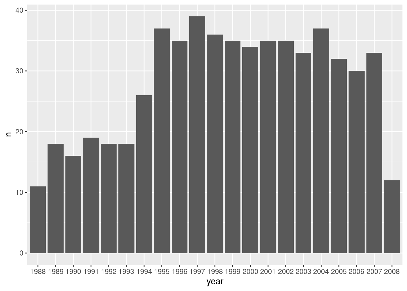
side R note - notice how in the command above ggplot and data summary are combined.
How many data points do we have by country?
df %>%
  group_by(country) %>%
  summarise(n=n()) %>%
  ggplot() +
  geom_bar(aes(x=country, y=n), stat='identity')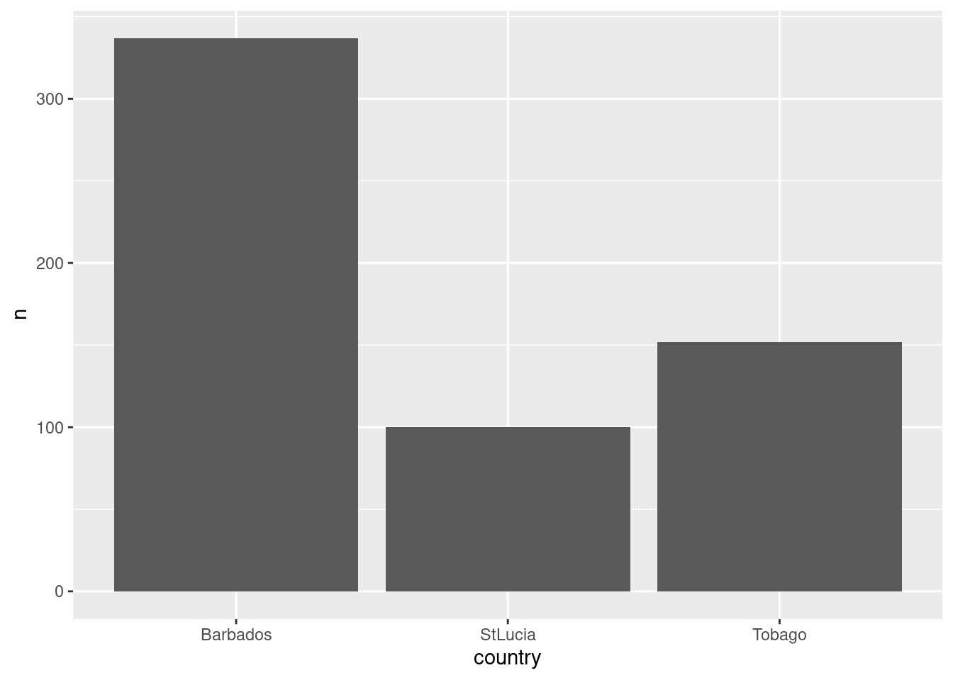
How many data points do we have by vessel?
df %>%
  group_by(vessel) %>%
  summarise(n=n()) %>%
  ggplot() +
  geom_bar(aes(x=vessel, y=n), stat='identity')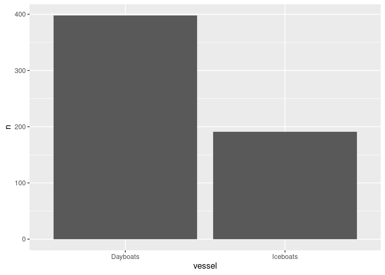
Bargraphs can be used to visualize overall trends in the data. For example, to see how the total catch is changing over years.
df %>%
ggplot() +
  geom_bar(aes(x = year, y = catch), stat= 'identity')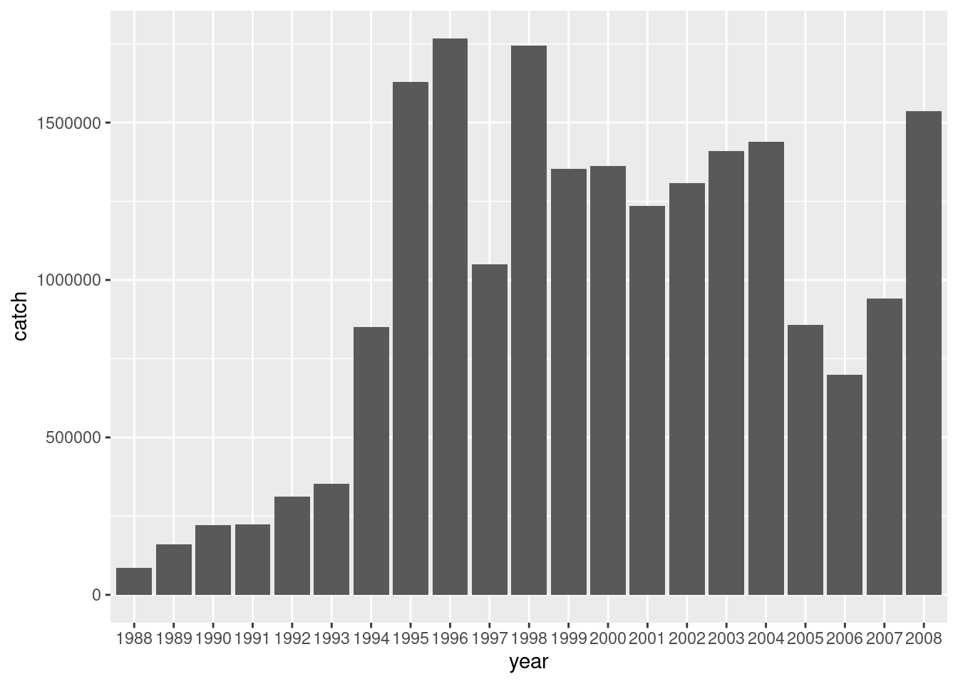
df %>%
ggplot() +
  geom_bar(aes(x = month, y = catch), stat= 'identity')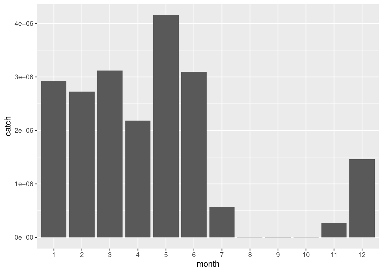
Lets see how this trend looks by country.
df %>%
ggplot() +
geom_bar(aes(x = year, y = catch, fill = country), stat= 'identity') 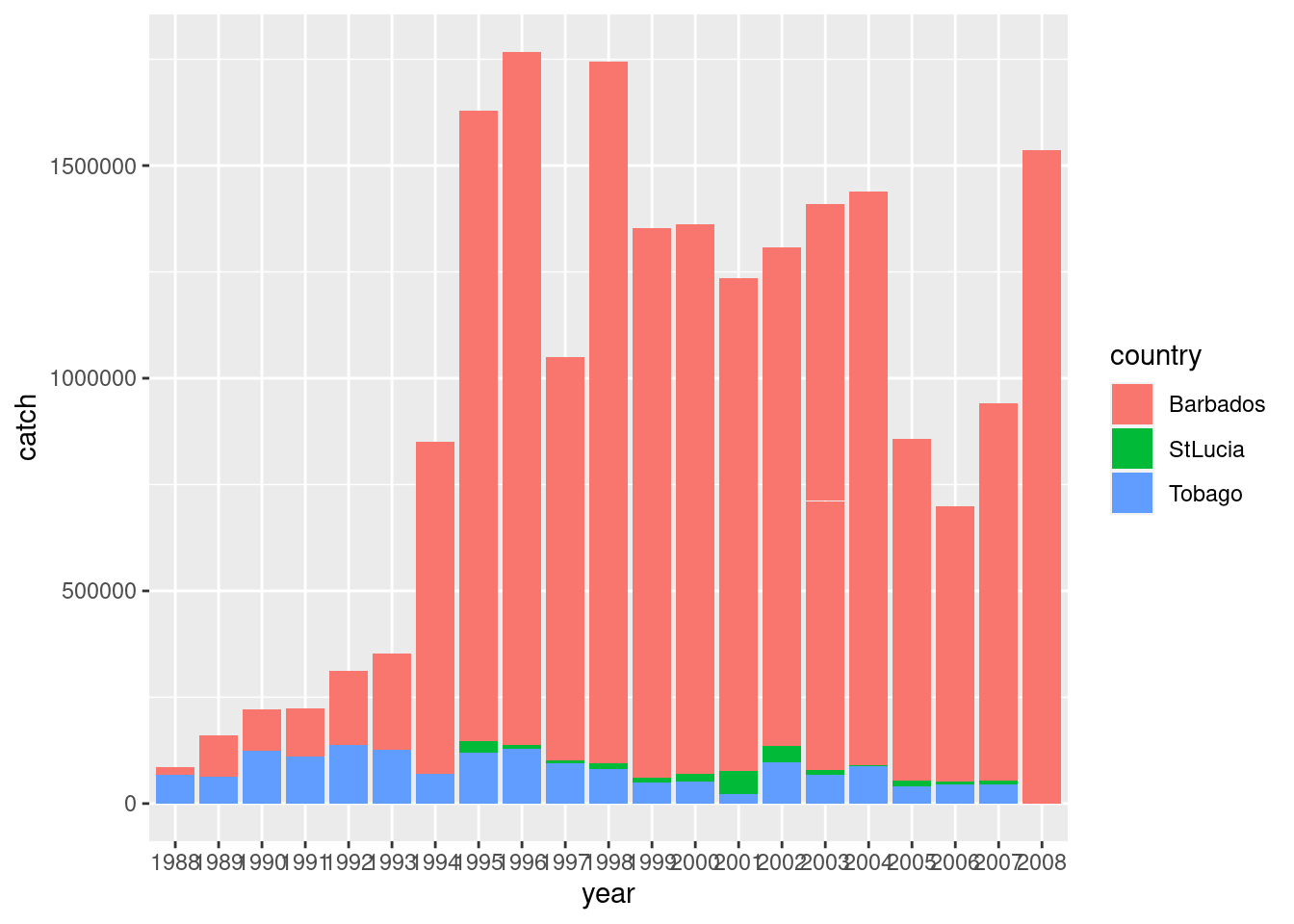
We see that catch landings from Barbados are much higher than St Lucia and Tobago. And the 2008 data are only from Barbados. What more can we see?
How is the catch distributed among vessel types by country?
df %>%
ggplot() +
  geom_bar(aes(x = year, y = catch, fill = vessel), stat='identity') +
facet_wrap(~ country) 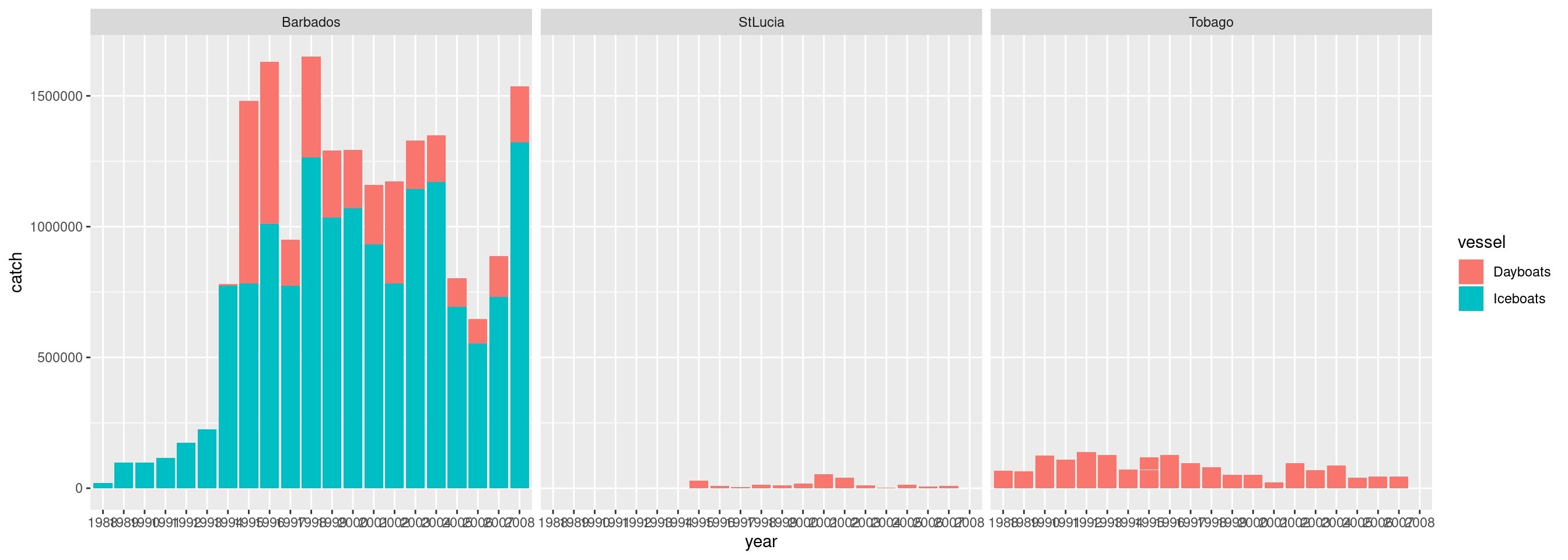
We see Iceboats have a higher reported catch than dayboats and this vessel type only operates in Barbados; and in 2008 a really high catch was reported from this vessel type. Is that correct?
In this exercise we will use another method of visualization to learn more about the data. Boxplots are useful for visualizing the spread of the data points. Generate boxplots of catch by year, month, country, vessel and think about the interpretation of the plot. Hint, barplots give a summation and boxplots don’t.
ggplot(df,
       aes(x = year, y = catch, group = year)) +
  geom_boxplot()
We could visualize the same for effort (number of trips).
df %>%
  ggplot() +
  geom_bar(aes(x = year, y = effort), stat= 'identity')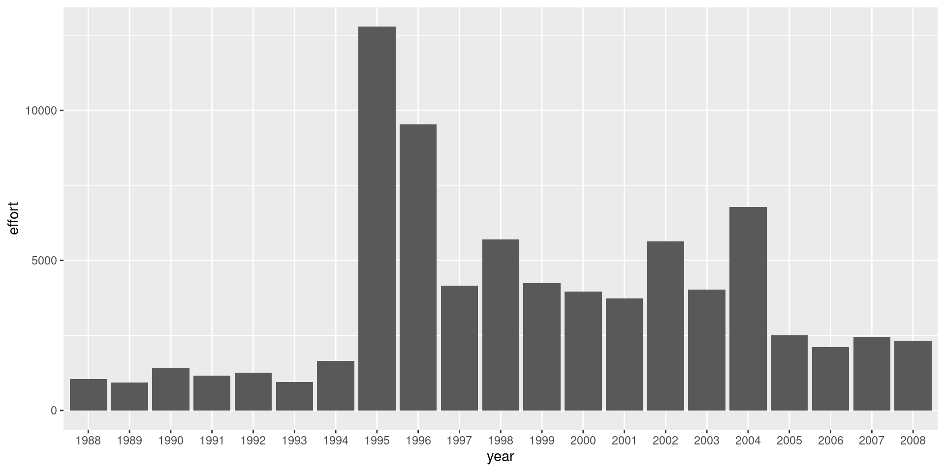
df %>%
  ggplot() +
  geom_bar(aes(x = month, y = effort), stat= 'identity')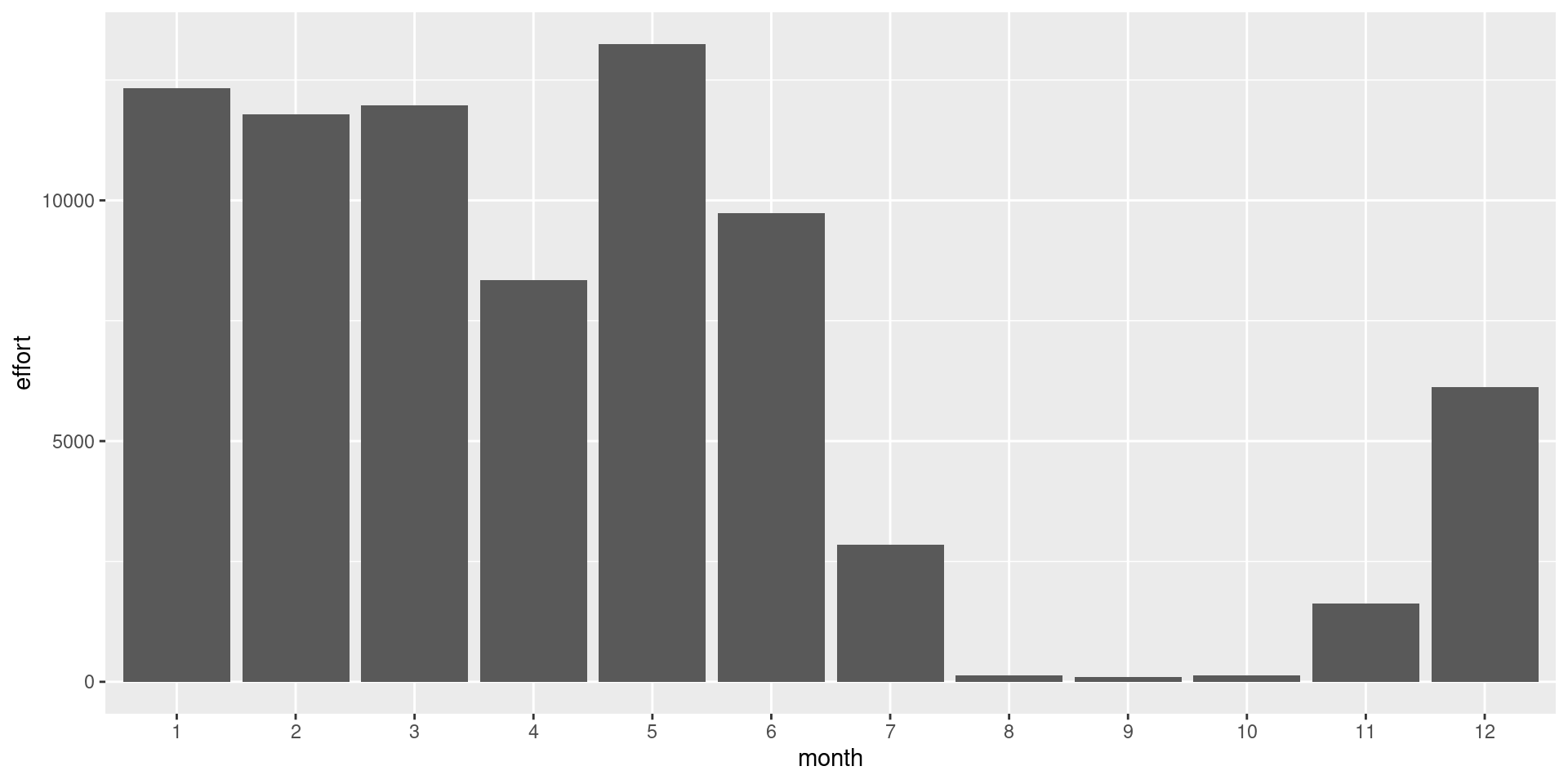
df %>%
  ggplot() +
geom_bar(aes(x = year, y = effort, fill = country), stat= 'identity') 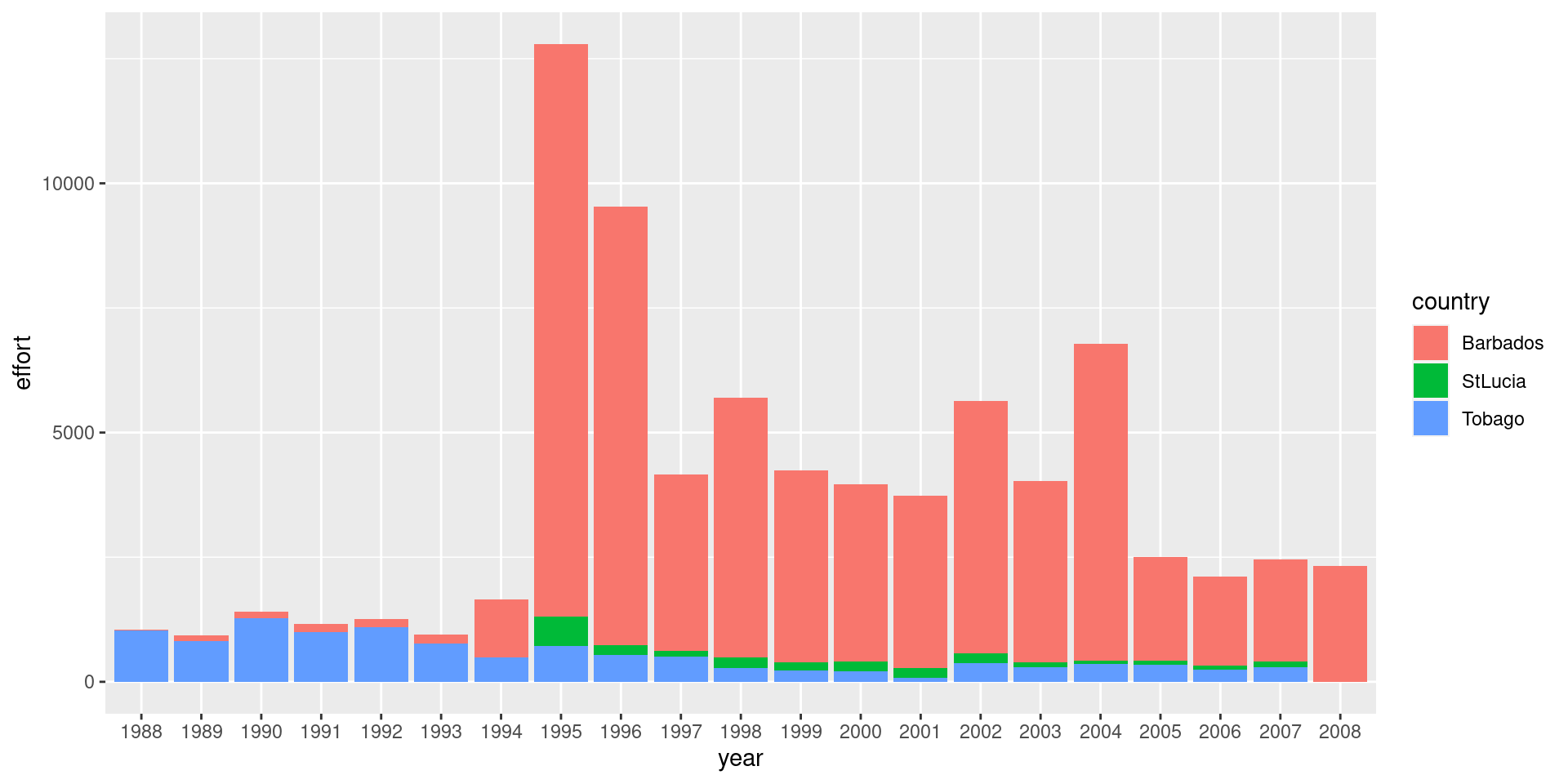
df %>%
  ggplot() +
  geom_bar(aes(x = year, y = effort, fill = vessel), stat='identity') +
facet_wrap(~ country) 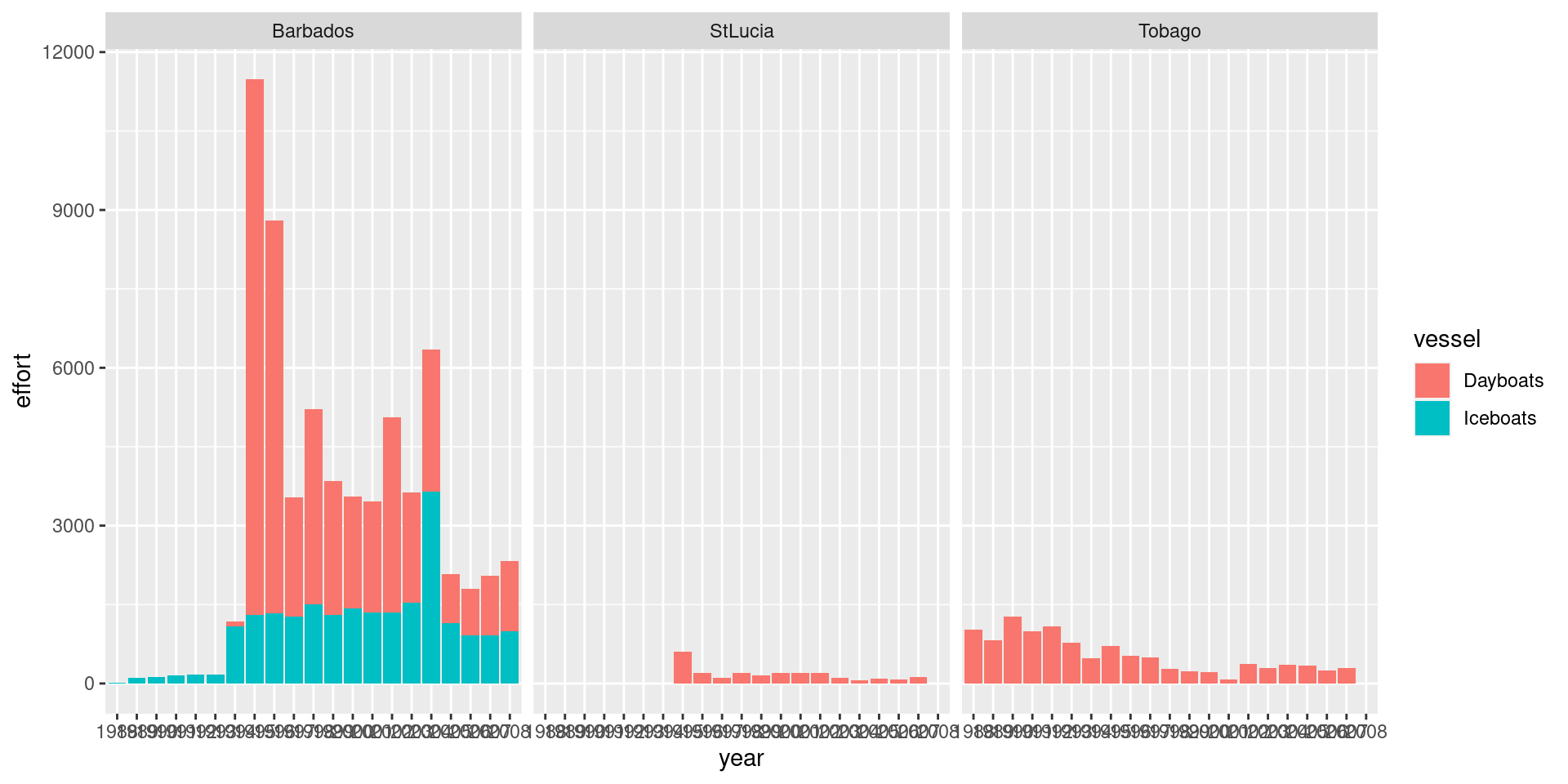
Catch and effort is dominated by Barbados hence leading to highest catch. Dayboats make more trips but the catch is higher from Iceboats. The use of dayboats have decreased in the latter part of the time series.
A model can account for such discrepancies and give a predicted index which is more standardized across such factors.
<<<<<<< HEAD # Modelling
Model Formulation
\[ E[Y] = g^{-1}(X\beta) \] where:
\(E[Y]\) expected value of your response varible
\(g^-1\) is the link
\(X\beta\) is the linear combination of parameters
\(X\beta = \beta_0 + X\beta_1 + X\beta_2 + ...\)
# Modelling
Model Formulation
\[ E[Y] = g^{-1}(X\beta) \] where: $ E[Y] $ expected value of your response varible $ g^-1 $ is the link $ X$ is the linear combination of parameters $ X= _0 + X_1 + X_2 + … $ >>>>>>> 29f2b277c746a9f64f4ad4fa86057f4efbfdf297
Lets plot the distribution of our variables and transform them appropriately for modelling. We have two continuous variables and the rest, year, month, country and vessel are categorical variables. We can visualize any skewness in distribution using histograms. A binwidth of 5000 is used in this example for catch because it is more in the order of magnitude of the catch. Similarly 50 is used for effort.
ggplot(df) +
  geom_histogram(aes(catch),
                 binwidth = 5000)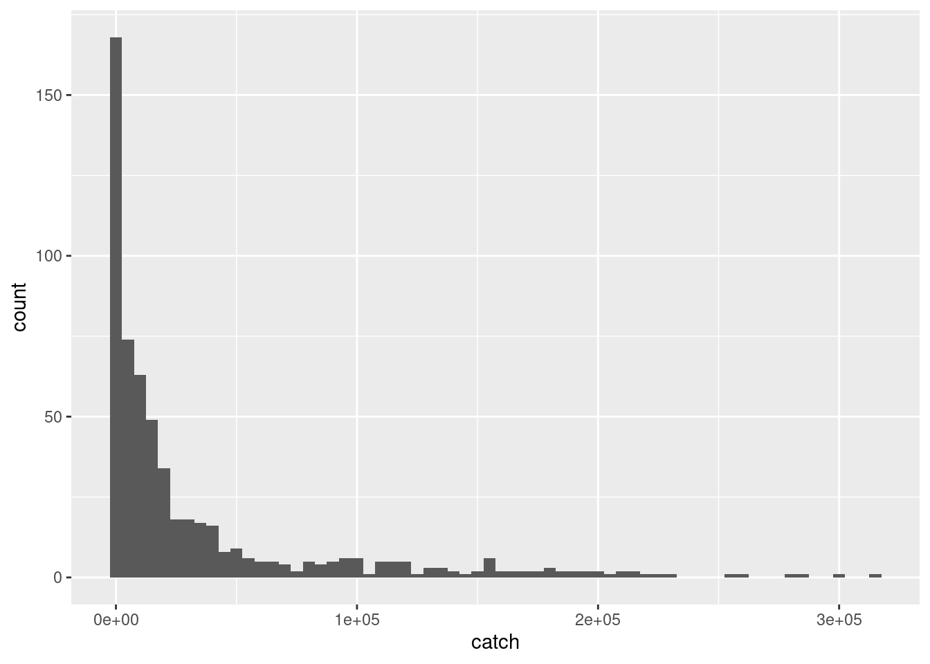
ggplot(df) +
  geom_histogram(aes(effort),
                 binwidth = 50)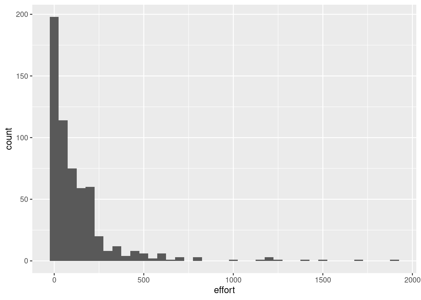
It is obvious that a log transformation is required for both catch and effort before modelling. This we have done preemptively. Lets move forward to model formulation.
Stepwise regression approach
A stepwise regression approach is encouraged to deduce which variables are most influential in CPUE standardization. This also gives a better understanding of the dynamics in the fishery. To do this we will add one variable at a time. Starting with year, followed by month, vessel, than country. We will check model diagnostics to gauge the performance of the model and compare how the standardized index of abundance changes between models to identify influential variables.
Lets construct our models:
model_1 <- glm(formula = lcatch ~ leffort + year, data = df)

summary(model_1)
Call:
glm(formula = lcatch ~ leffort + year, data = df)

Deviance Residuals:
    Min       1Q   Median       3Q      Max
-4.9783  -0.9414  -0.0934   1.0205   3.3655

Coefficients:
            Estimate Std. Error t value Pr(>|t|)
(Intercept)  2.93728    0.38706   7.589 1.33e-13 ***
leffort      1.28543    0.03049  42.158  < 2e-16 ***
year1989     1.14268    0.47063   2.428 0.015493 *
year1990     1.27486    0.48122   2.649 0.008293 **
year1991     1.57784    0.46552   3.389 0.000749 ***
year1992     1.34727    0.47020   2.865 0.004320 **
year1993     1.78784    0.47028   3.802 0.000159 ***
year1994     1.00265    0.44193   2.269 0.023656 *
year1995     0.19229    0.42282   0.455 0.649446
year1996     0.53346    0.42520   1.255 0.210139
year1997     0.54010    0.41942   1.288 0.198365
year1998     0.95752    0.42332   2.262 0.024078 *
year1999     0.84863    0.42465   1.998 0.046146 *
year2000     1.06985    0.42627   2.510 0.012358 *
year2001     1.26394    0.42469   2.976 0.003043 **
year2002     1.03974    0.42485   2.447 0.014694 *
year2003     0.74258    0.42778   1.736 0.083126 .
year2004     0.56026    0.42213   1.327 0.184968
year2005     1.09803    0.42938   2.557 0.010809 *
year2006     1.08943    0.43305   2.516 0.012155 *
year2007     1.01514    0.42773   2.373 0.017962 *
year2008     1.69458    0.51500   3.290 0.001062 **
---
Signif. codes:  0 '***' 0.001 '**' 0.01 '*' 0.05 '.' 0.1 ' ' 1

(Dispersion parameter for gaussian family taken to be 1.509238)

    Null deviance: 3697.88  on 588  degrees of freedom
Residual deviance:  855.74  on 567  degrees of freedom
AIC: 1937.5

Number of Fisher Scoring iterations: 2
In the above model the variable we are trying to “explain” is the catch (on a log-scale) as a function of the effort (on a log scale) with year as a categorical predictor variable. Note the comparison of years is being done with the first year in the time series 1988, which is why it is missing from the model summary. And it shows most years are significantly different from 1988.
The intercept is from the linear model and is the predicted value of the dependent variable when all the independent variables are 0 (same as in linear regression).
Lets check model residuals and deviance explained. We can postulate from the deviance values that the model explains a significant portion of the variability. The null number is much higher than the residual number. This can be calculated as follows:
deviance_explained <- 1 - (model_1$deviance/model_1$null.deviance)The model explains 77% deviance. Are the model assumptions of normality and homoscedasticity met?
plot(model_1)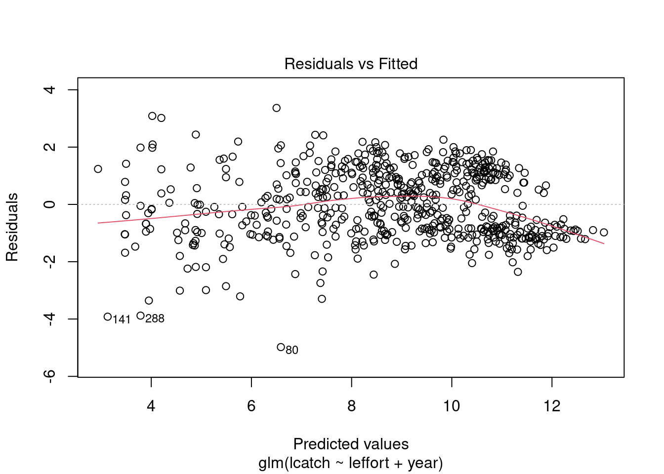
Residuals are not normally distributed. The distribution of residuals is bimodal. We can also plot a histogram of residuals with a density plot to show the normality of residuals. Lets extract our residuals using the modelr package.
aug.dat.1 <-
  df %>%
  add_predictions(model_1) %>%
  add_residuals(model_1)

ggplot(aug.dat.1,
       aes(resid)) +
  geom_histogram(aes(y=after_stat(density),), position="identity", alpha=0.5, col='grey50', fill='grey50') +
  ylab("Density") + xlab("Model residuals")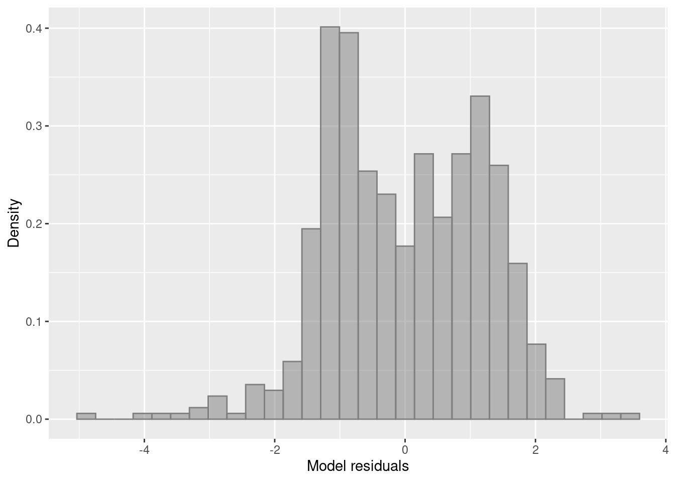
Lets add another variable to our model, month, and look at model diagnostics.
model_2 <- glm(formula = lcatch ~ leffort + year + month, data = df)

summary(model_2)
Call:
glm(formula = lcatch ~ leffort + year + month, data = df)

Deviance Residuals:
    Min       1Q   Median       3Q      Max
-4.7374  -0.8965  -0.0585   0.9643   3.4768

Coefficients:
            Estimate Std. Error t value Pr(>|t|)
(Intercept)  3.35971    0.42603   7.886 1.66e-14 ***
leffort      1.20262    0.03628  33.149  < 2e-16 ***
year1989     1.05311    0.46580   2.261 0.024152 *
year1990     1.20165    0.47667   2.521 0.011984 *
year1991     1.56318    0.46058   3.394 0.000738 ***
year1992     1.29879    0.46496   2.793 0.005397 **
year1993     1.74800    0.46577   3.753 0.000193 ***
year1994     0.96587    0.43762   2.207 0.027716 *
year1995     0.28791    0.41941   0.686 0.492707
year1996     0.63642    0.42150   1.510 0.131643
year1997     0.59969    0.41583   1.442 0.149817
year1998     0.98993    0.41931   2.361 0.018577 *
year1999     0.83338    0.42047   1.982 0.047971 *
year2000     1.12711    0.42238   2.668 0.007842 **
year2001     1.24353    0.42046   2.958 0.003233 **
year2002     1.04793    0.42027   2.493 0.012939 *
year2003     0.74324    0.42386   1.754 0.080066 .
year2004     0.69629    0.42021   1.657 0.098083 .
year2005     1.07957    0.42533   2.538 0.011414 *
year2006     1.00857    0.42880   2.352 0.019017 *
year2007     0.95635    0.42336   2.259 0.024274 *
year2008     1.69947    0.51070   3.328 0.000933 ***
month2      -0.03601    0.20899  -0.172 0.863271
month3      -0.08208    0.20914  -0.392 0.694866
month4      -0.24404    0.21386  -1.141 0.254317
month5       0.23793    0.20901   1.138 0.255459
month6       0.16331    0.21077   0.775 0.438763
month7      -0.27502    0.23415  -1.175 0.240687
month8      -0.83842    0.36880  -2.273 0.023385 *
month9      -1.54124    0.58102  -2.653 0.008214 **
month10     -0.84976    0.38250  -2.222 0.026714 *
month11     -0.46641    0.24366  -1.914 0.056110 .
month12     -0.06149    0.22060  -0.279 0.780559
---
Signif. codes:  0 '***' 0.001 '**' 0.01 '*' 0.05 '.' 0.1 ' ' 1

(Dispersion parameter for gaussian family taken to be 1.472539)

    Null deviance: 3697.88  on 588  degrees of freedom
Residual deviance:  818.73  on 556  degrees of freedom
AIC: 1933.5

Number of Fisher Scoring iterations: 2
We see the autumn months are significantly different from month 1 because the catch is quite low. Lets check our residuals and see if there is an improvement.
aug.dat.2 <-
  df %>%
  add_predictions(model_2) %>%
  add_residuals(model_2)

ggplot(aug.dat.2,
       aes(resid)) +
  geom_histogram(aes(y=after_stat(density),), position="identity", alpha=0.5, col='grey50', fill='grey50')+
  ylab("Density") + xlab("Model residuals")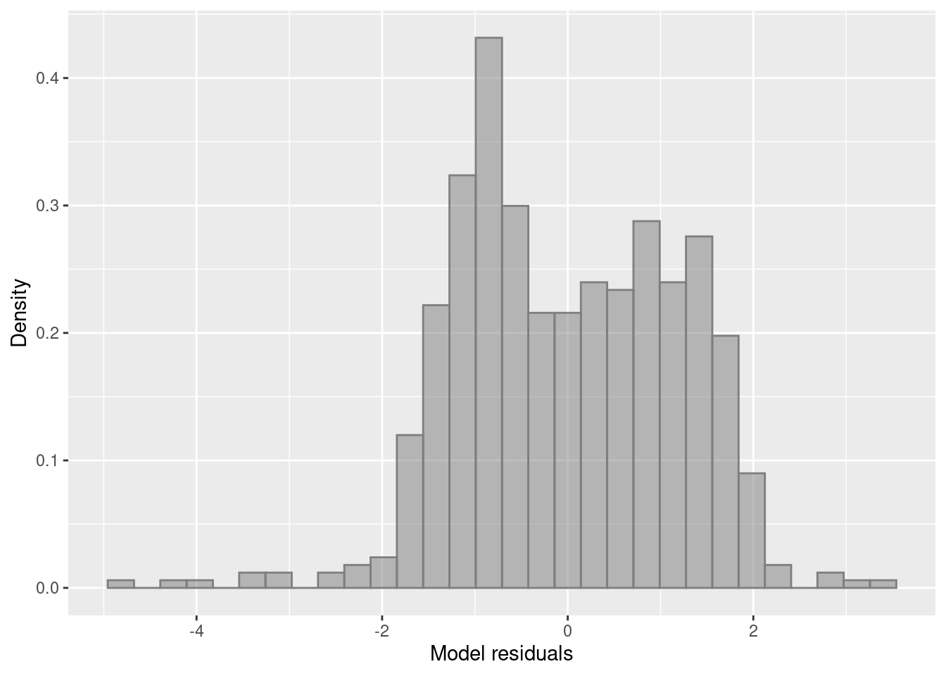
Still not a lot of improvement. So we can add the next variable.
Build the third model and add variable vessel and plot the residuals.
model_3 <- glm(formula = lcatch ~ leffort + year + month + vessel, data = df)

summary(model_3)
Call:
glm(formula = lcatch ~ leffort + year + month + vessel, data = df)

Deviance Residuals:
    Min       1Q   Median       3Q      Max
-4.2122  -0.4393  -0.0133   0.4454   3.2002

Coefficients:
               Estimate Std. Error t value Pr(>|t|)
(Intercept)     3.53885    0.28781  12.296  < 2e-16 ***
leffort         1.10107    0.02482  44.368  < 2e-16 ***
year1989        0.33337    0.31582   1.056 0.291634
year1990        0.38442    0.32349   1.188 0.235204
year1991        0.86932    0.31223   2.784 0.005548 **
year1992        0.62943    0.31509   1.998 0.046248 *
year1993        1.08200    0.31563   3.428 0.000653 ***
year1994        0.51460    0.29608   1.738 0.082752 .
year1995        0.20994    0.28327   0.741 0.458940
year1996        0.48911    0.28473   1.718 0.086391 .
year1997        0.40179    0.28094   1.430 0.153238
year1998        0.82495    0.28326   2.912 0.003732 **
year1999        0.60523    0.28411   2.130 0.033592 *
year2000        0.97764    0.28532   3.426 0.000657 ***
year2001        1.05665    0.28406   3.720 0.000220 ***
year2002        0.90742    0.28389   3.196 0.001471 **
year2003        0.55489    0.28636   1.938 0.053160 .
year2004        0.46188    0.28394   1.627 0.104379
year2005        0.79327    0.28747   2.759 0.005980 **
year2006        0.70023    0.28985   2.416 0.016020 *
year2007        0.72195    0.28607   2.524 0.011892 *
year2008        1.11254    0.34566   3.219 0.001363 **
month2         -0.04443    0.14115  -0.315 0.753024
month3         -0.10168    0.14125  -0.720 0.471923
month4         -0.32503    0.14447  -2.250 0.024851 *
month5          0.22770    0.14116   1.613 0.107306
month6          0.12747    0.14235   0.895 0.370934
month7         -0.57782    0.15857  -3.644 0.000294 ***
month8         -1.33595    0.24983  -5.347 1.31e-07 ***
month9         -1.71201    0.39246  -4.362 1.53e-05 ***
month10        -1.62067    0.26006  -6.232 9.12e-10 ***
month11        -0.89747    0.16541  -5.426 8.63e-08 ***
month12        -0.26096    0.14918  -1.749 0.080798 .
vesselIceboats  1.93129    0.07495  25.767  < 2e-16 ***
---
Signif. codes:  0 '***' 0.001 '**' 0.01 '*' 0.05 '.' 0.1 ' ' 1

(Dispersion parameter for gaussian family taken to be 0.6716628)

    Null deviance: 3697.88  on 588  degrees of freedom
Residual deviance:  372.77  on 555  degrees of freedom
AIC: 1472.1

Number of Fisher Scoring iterations: 2aug.dat.3 <-
df %>%
add_predictions(model_3) %>%
add_residuals(model_3)
ggplot(aug.dat.3,
aes(resid)) +
geom_histogram(aes(y=after_stat(density),), position="identity", alpha=0.5, col='grey50', fill='grey50')+
ylab("Density") + xlab("Model residuals")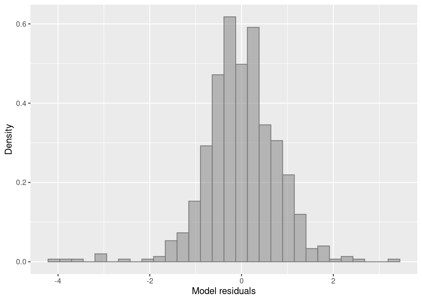
Vessels are significantly different from each other. Remember a comparison of Iceboats is being made with Dayboats which does not show in the model summary.
Now we are starting to see a bell curve (Gaussian distribution). The deviance explained has also increased to 89%.
deviance_explained <- 1 - (model_3$deviance/model_3$null.deviance)We know countries are considerably different in the amounts of landed catch therefore we want to include this last variable in the model and do model comparisons.
model_4 <- glm(formula = lcatch ~ leffort + year + month + vessel + country, data = df)

summary(model_4)
Call:
glm(formula = lcatch ~ leffort + year + month + vessel + country,
    data = df)

Deviance Residuals:
    Min       1Q   Median       3Q      Max
-4.0032  -0.3862   0.0506   0.4340   3.4714

Coefficients:
               Estimate Std. Error t value Pr(>|t|)
(Intercept)     3.32651    0.32233  10.320  < 2e-16 ***
leffort         1.05153    0.03087  34.058  < 2e-16 ***
year1989        0.41083    0.30178   1.361 0.173953
year1990        0.50806    0.30894   1.645 0.100640
year1991        0.98037    0.29780   3.292 0.001058 **
year1992        0.73147    0.30055   2.434 0.015257 *
year1993        1.17973    0.30107   3.918 0.000100 ***
year1994        0.71047    0.28498   2.493 0.012954 *
year1995        0.64791    0.27538   2.353 0.018984 *
year1996        0.86752    0.27534   3.151 0.001717 **
year1997        0.75707    0.27162   2.787 0.005499 **
year1998        1.21512    0.27451   4.426 1.15e-05 ***
year1999        0.99096    0.27530   3.600 0.000347 ***
year2000        1.39016    0.27692   5.020 6.98e-07 ***
year2001        1.46239    0.27593   5.300 1.68e-07 ***
year2002        1.29172    0.27486   4.700 3.30e-06 ***
year2003        0.93242    0.27723   3.363 0.000823 ***
year2004        0.87069    0.27541   3.161 0.001656 **
year2005        1.18142    0.27903   4.234 2.69e-05 ***
year2006        1.00108    0.28003   3.575 0.000381 ***
year2007        1.08888    0.27721   3.928 9.65e-05 ***
year2008        1.53798    0.33541   4.585 5.61e-06 ***
month2         -0.05906    0.13434  -0.440 0.660356
month3         -0.12176    0.13450  -0.905 0.365745
month4         -0.39176    0.13843  -2.830 0.004824 **
month5          0.21219    0.13436   1.579 0.114843
month6          0.09258    0.13569   0.682 0.495333
month7         -0.67453    0.15622  -4.318 1.87e-05 ***
month8         -1.45909    0.26050  -5.601 3.36e-08 ***
month9         -1.92004    0.38547  -4.981 8.47e-07 ***
month10        -1.72528    0.26281  -6.565 1.20e-10 ***
month11        -0.94345    0.16516  -5.712 1.82e-08 ***
month12        -0.25471    0.14317  -1.779 0.075786 .
vesselIceboats  2.07469    0.09186  22.585  < 2e-16 ***
countryStLucia -0.36789    0.13503  -2.725 0.006643 **
countryTobago   0.48707    0.10580   4.604 5.15e-06 ***
---
Signif. codes:  0 '***' 0.001 '**' 0.01 '*' 0.05 '.' 0.1 ' ' 1

(Dispersion parameter for gaussian family taken to be 0.6080256)

    Null deviance: 3697.88  on 588  degrees of freedom
Residual deviance:  336.24  on 553  degrees of freedom
AIC: 1415.3

Number of Fisher Scoring iterations: 2aug.dat.4 <-
df %>%
add_predictions(model_4) %>%
add_residuals(model_4)
ggplot(aug.dat.4,
aes(resid)) +
geom_histogram(aes(y=after_stat(density),), position="identity", alpha=0.5, col='grey50', fill='grey50')+
geom_density(aes(resid),adjust=2.5,color='blue') +
ylab("Density") + xlab("Model residuals")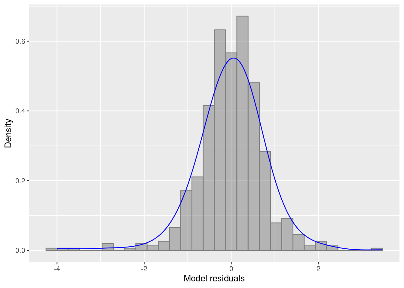
We can also check other residual plots to check the assumptions about homogeneity of variance.
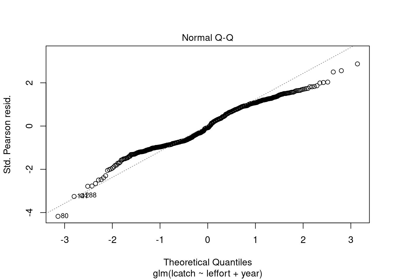
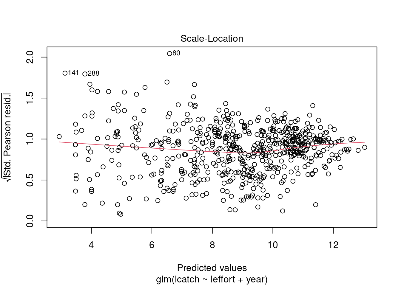
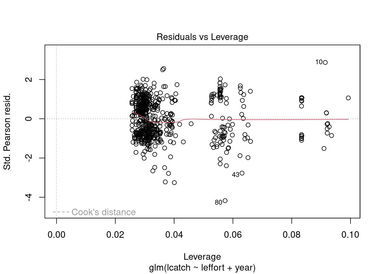
plot(model_4)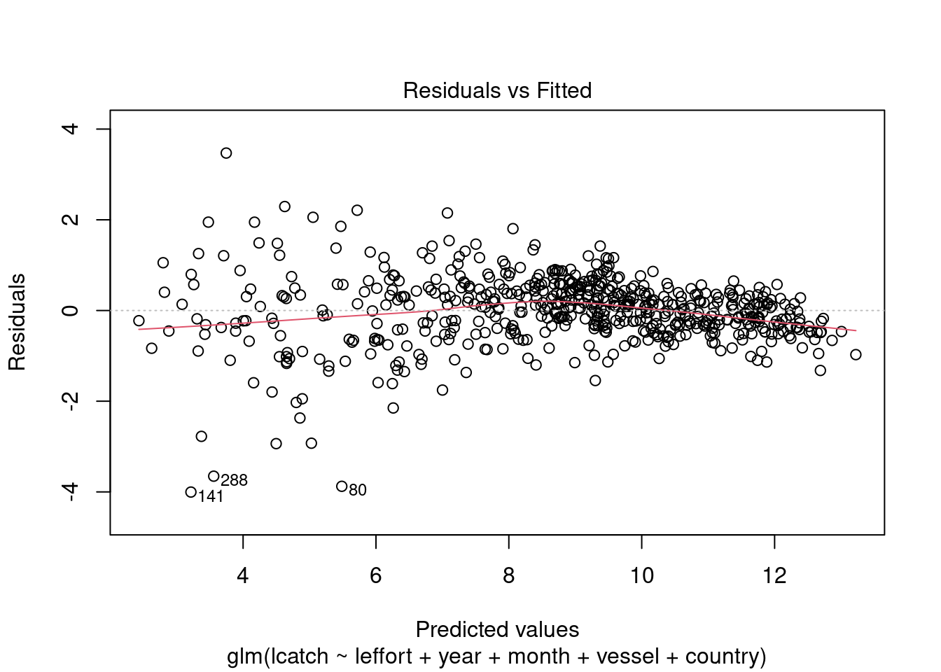
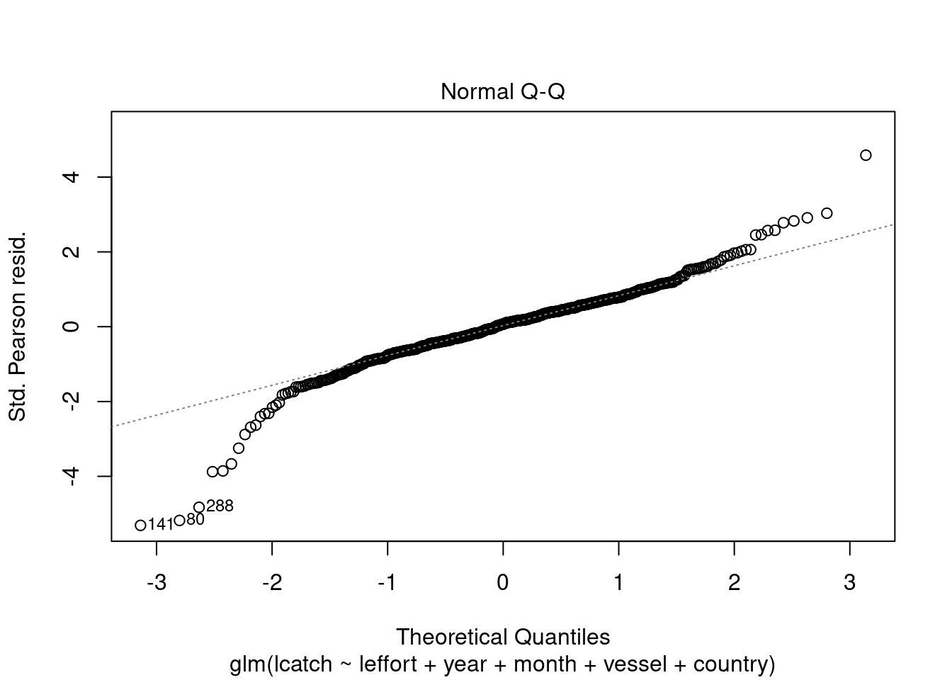
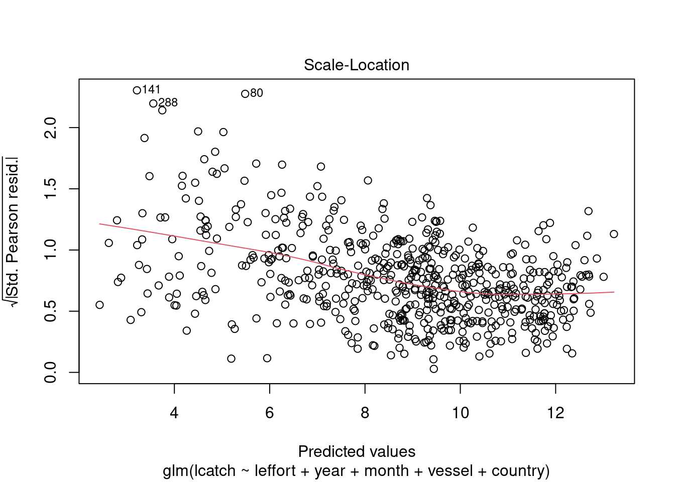
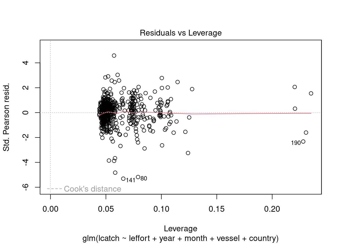
We see there could be some influential variables. We will address this later.
A metric we have disregarded thus far is the AIC (Akaike Information Criterion). This is reported in the summary of the model. The AIC provides a method for assessing the quality of your model through comparison of related models. It’s based on the Deviance, but penalizes you for making the model more complicated. Much like adjusted R-squared, it’s intent is to prevent you from including irrelevant predictors.However, unlike adjusted R-squared, the number itself is not meaningful. If you have more than one similar candidate models (where all of the variables of the simpler model occur in the more complex models), then you should select the model that has the smallest AIC. We will look at that later on when model selection and influence of variables is described. Lets look at the AIC of our four models. (Add more from Bjarki?)
model_1$aic[1] 1937.524model_2$aic[1] 1933.485model_3$aic[1] 1472.067model_4$aic[1] 1415.312According to the AIC criteria we would pick model_4 as the best model.
Step plot to study influence of variable on CPUE
The information we are most interested in is how this index of abundance (predicted catch from the model) is changing across time for which we need to extract the mean year effect.
We can get the coefficient statistics with the tidy function from the broom package from each model and bind together into a data frame.
r1 <-
  model_1 %>%
  tidy() %>%
  mutate(model = "1. + year")

r2 <-
  model_2 %>%
  tidy() %>%
  mutate(model = "2. + month")

r3 <-
  model_3 %>%
  tidy() %>%
  mutate(model = "3. + vessel")

r4 <-
  model_4 %>%
  tidy() %>%
  mutate(model = "4. + country")

d <-
  bind_rows(r1, r2) %>%
  bind_rows(r3) %>%
  bind_rows(r4)

d
# A tibble: 125 × 6
term estimate std.error statistic p.value model
<chr> <dbl> <dbl> <dbl> <dbl> <chr>
1 (Intercept) 2.94 0.387 7.59 1.33e- 13 1. + year
2 leffort 1.29 0.0305 42.2 6.72e-177 1. + year
3 year1989 1.14 0.471 2.43 1.55e- 2 1. + year
4 year1990 1.27 0.481 2.65 8.29e- 3 1. + year
5 year1991 1.58 0.466 3.39 7.49e- 4 1. + year
6 year1992 1.35 0.470 2.87 4.32e- 3 1. + year
7 year1993 1.79 0.470 3.80 1.59e- 4 1. + year
8 year1994 1.00 0.442 2.27 2.37e- 2 1. + year
9 year1995 0.192 0.423 0.455 6.49e- 1 1. + year
10 year1996 0.533 0.425 1.25 2.10e- 1 1. + year
# ℹ 115 more rowsWe thus have a dataframe with the following columns:
term: these are related explanatory variables we included in the analysis (log effort, year, month, vessel, country)
estimate: These are the coefficient estimates (see later).
std.error: The standard error of the coefficients.
statistic: The t-statistics.
p.value: The probability value that indicate significance.
model name: The name we assigned
Because the coefficient values (estimate) and the associated error are on a log scale we need to rescale them to observe values that make sense:
d <-
  d %>%
  mutate(mean = exp(estimate),
         lower.ci = exp(estimate - 2 * std.error),
         upper.ci = exp(estimate + 2 * std.error)) %>%
  filter(str_detect(term, "year")) %>%
  mutate(term = str_replace(term, "year", ""),
         term = as.integer(term))
Now we can visualize how the index of abundance changes with addition of each variable in the model.
d %>%
  ggplot(aes(term, mean, colour = model)) +
  geom_line() +
  geom_point() +
  labs(x = NULL, y = "Standardized index of abundance")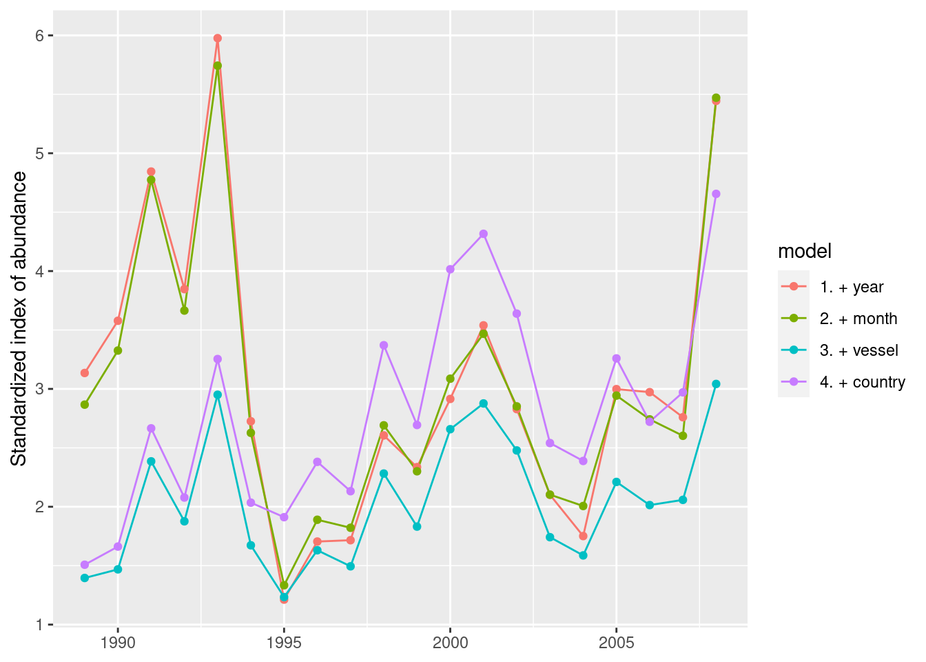
There is not a big difference when month is added. But a shift is seen when vessel is added and a considerable jump is also seen with country is added. Therefore, we can postulate vessel and country are more influential.
Note this is a relative comparison we cannot decide from this analysis whether the CPUE reflects the biomass in the true sense. What we have obtained from this analysis is a standardized index of abundance which has taken into account variables that may violate the assumption of constant catchability q = 1.
We can also study the which variables explain the most deviance by doing an ANOVA on our GLM:
anova(model_4, test = "F")Analysis of Deviance Table
Model: gaussian, link: identity
Response: lcatch
Terms added sequentially (first to last)
Df Deviance Resid. Df Resid. Dev F Pr(>F)
NULL 588 3697.9
leffort 1 2754.46 587 943.4 4530.1633 < 2.2e-16 ***
year 20 87.69 567 855.7 7.2109 < 2.2e-16 ***
month 11 37.01 556 818.7 5.5330 1.993e-08 ***
vessel 1 445.96 555 372.8 733.4538 < 2.2e-16 ***
country 2 36.53 553 336.2 30.0437 4.107e-13 ***
---
Signif. codes: 0 '***' 0.001 '**' 0.01 '*' 0.05 '.' 0.1 ' ' 1The variable vessel explains the most deviance.
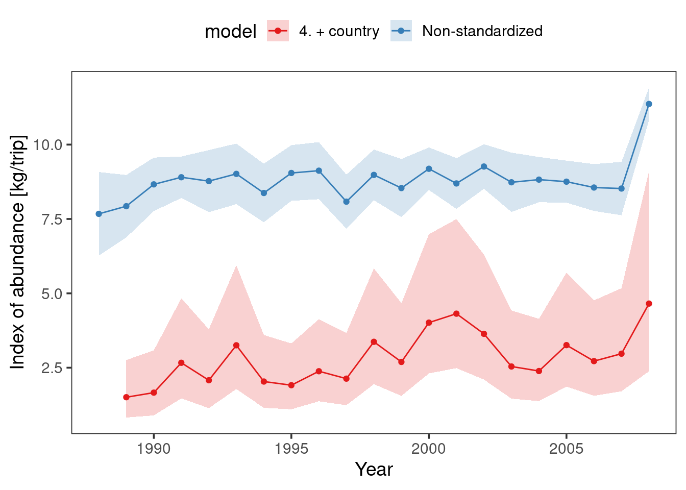
Finally we can do a comparison of our raw CPUE (also called nominal CPUE) to visualize the result of standardization. If there isn’t much deviation from the raw then standardization is not needed.
Lets combine our raw CPUE and standardized CPUE from the final model.
raw <-
  df %>%
  group_by(year) %>%
  summarize(mean = mean(log(catch)),
            std.error = sd(log(catch))/sqrt(length(catch)),
            lower.ci = mean - 1.96 * std.error,
            upper.ci = mean + 1.96 * std.error) |>
  select(year, mean, lower.ci, upper.ci) |>
  mutate(model = "Non-standardized",
         year = as.numeric(year) + 1987)

mod <-
  d %>%
  filter(model == "4. + country") %>%
  select(term, mean, lower.ci, upper.ci, model) |>
  rename("year" = "term")


bind_rows(raw, mod) |>
  ggplot(aes(year, mean)) +
  theme_bw(base_size = 14)+
  geom_line(aes(colour = model)) +
  geom_point(aes(colour = model)) +
  geom_ribbon(aes(ymin = lower.ci,
                  ymax = upper.ci,
                  fill = model),
              alpha = 0.2) +
  theme(legend.position = "top",legend.background = element_rect(fill = "white"))+
  theme(panel.grid.major = element_blank(), panel.grid.minor = element_blank()) +
  scale_colour_brewer(palette = "Set1") +
  scale_fill_brewer(palette = "Set1") +
  labs(x = "Year", y = "Index of abundance [kg/trip]")