library(maps)
library(mapdata)
library(tidyverse)
library(patchwork)
w <- read_csv(file = "https://heima.hafro.is/~einarhj/data/minke.csv")Visualization - part II
Getting started
The minke data has two columns that refer to geographical coordinates. Lets plot the location of the minke sample:
w %>%
  ggplot(aes(lon, lat)) +
  geom_point(colour = "red")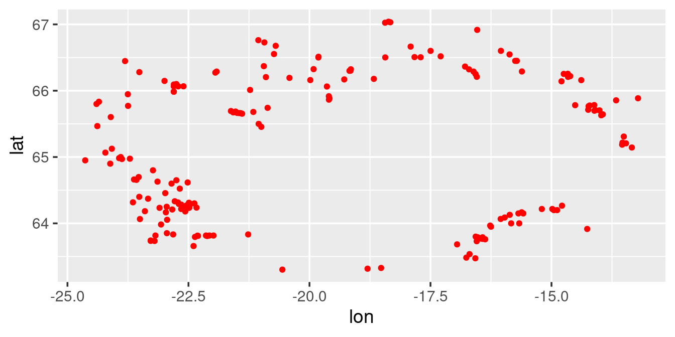
In the above plot, we basically have mapped the longitude on the x-axis and the latitude on the y-axis. There are two things missing:
- A background, giving the reader a better indication of the geographical region of the sample location.
- The projection (aspect ratio between the x- and the y-axis) looks wrong
Some backgrounds
- Maps as background for r-plot can come from myriad of sources. Here we take an example of objects available in the map- and mapdata-packages.
- To get the data into ggplot2 friendly form (data.frame) we use the
map_datafunction.
iceland <- map_data("world", region = "Iceland")
glimpse(iceland)
Rows: 454
Columns: 6
$ long <dbl> -15.54311, -15.42847, -15.24092, -15.16240, -14.96997, -14.8…
$ lat <dbl> 66.22852, 66.22480, 66.25913, 66.28169, 66.35971, 66.38145, …
$ group <dbl> 1, 1, 1, 1, 1, 1, 1, 1, 1, 1, 1, 1, 1, 1, 1, 1, 1, 1, 1, 1, …
$ order <int> 1, 2, 3, 4, 5, 6, 7, 8, 9, 10, 11, 12, 13, 14, 15, 16, 17, 1…
$ region <chr> "Iceland", "Iceland", "Iceland", "Iceland", "Iceland", "Icel…
$ subregion <chr> NA, NA, NA, NA, NA, NA, NA, NA, NA, NA, NA, NA, NA, NA, NA, …Here we have just a simple dataframe with coordinates and some other variables. We can try map these coordinates to different layers:
p <- ggplot(iceland, aes(long, lat)) + labs(x = NULL, y = NULL)
p1 <- p + geom_point()    + labs(title = "points")
p2 <- p + geom_line()     + labs(title = "line")
p3 <- p + geom_path()     + labs(title = "path")
p4 <- p + geom_polygon()  + labs(title = "polygon")
p1 + p2 + p3 + p4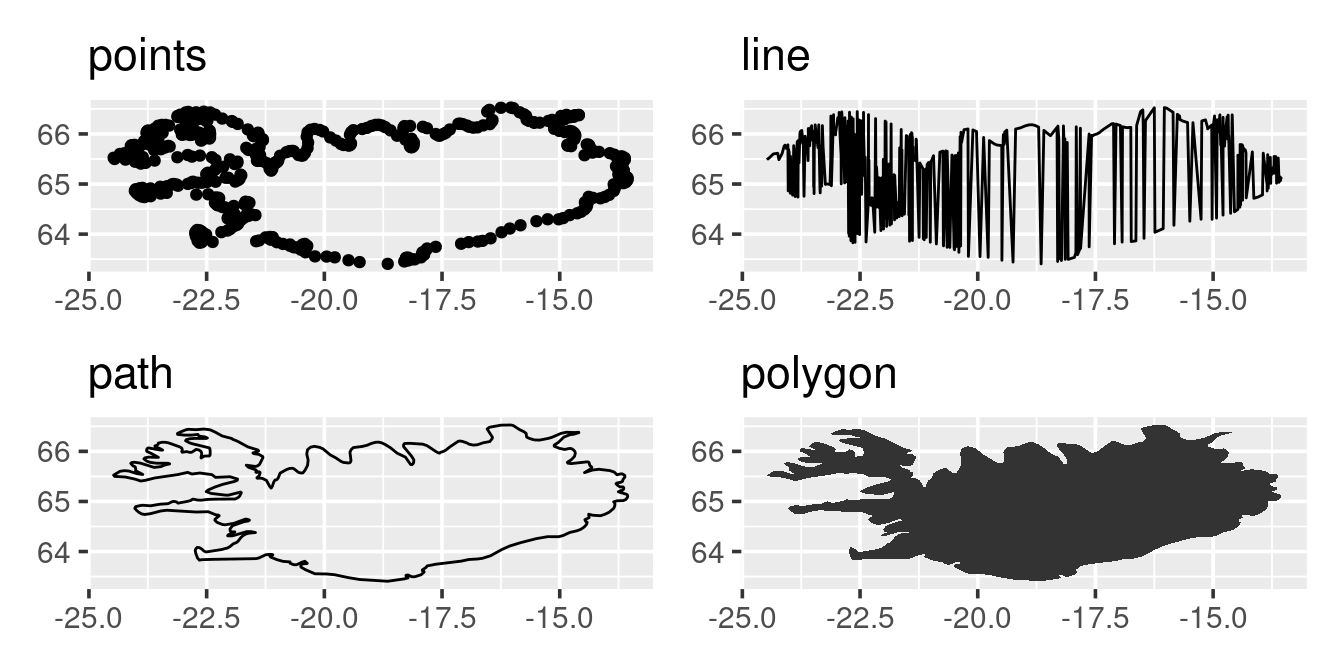
The above sweep of plots demonstrate that background maps are just a set of longitudinal and latitudinal data that are arrange-ed in a specific way (check help file for geom_line vs geom_path).
Projections
As noted above a map is just a xy-plot but with a certain projections. We could try to guess the projections (i.e. the aspect ration of the plot) as done on the left, or better still use the geom_quickmap function (on the right):
p1 <- p3 + coord_fixed(ratio = 2.4)
p2 <- p3 + coord_quickmap()
p1 + p2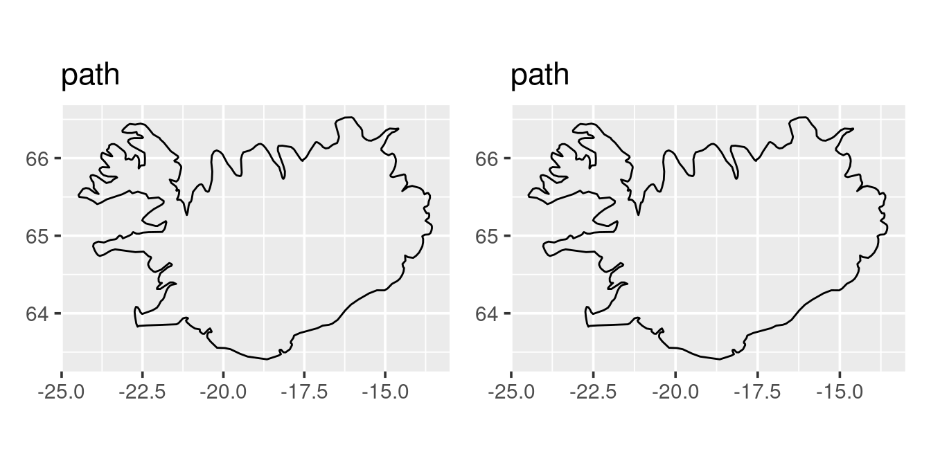
The above demonstrates that a spatial map in its simplest term is just an xy-plot with a specific projection. Note that the coord_quickmap is only an approximation, if one is operating on a fine scale coord_map may be more accurate (actually all maps are wrong when put on a two dimentional pane).
Selecting a background by boundaries
Instead of selecting a specific named region of a map one can also specify the boundaries, E.g. to get a map of the North Sea:
xlim <- c(-5, 12)
ylim <- c(52, 60)
m <- map_data("worldHires", xlim = xlim, ylim = ylim)
ggplot(m, aes(long, lat, group = group)) +
  geom_polygon() +
  coord_quickmap(xlim = xlim, ylim = ylim, expand = FALSE)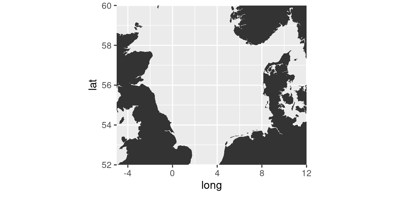
Here there are two additional element introduced:
- The variable group in the m-dataframe is a unique identifier of each separate shape (islands etc.). By specifying the arguement group in the
aes-function one prevents that polygons are drawn across separate elements (try omitting the group-argument). - The limits are specified inside the call in function
coord_quickmap. This is because the functionmap_datareturns the whole regions that fall within the boundaries (trycoord_quickmapwithout any argument).
Exercise
- Play around by selecting and plotting different regions or areas
- Read the
coord_maphelp file for projections other than the default “mercator”. Try to create a map that looks something along:
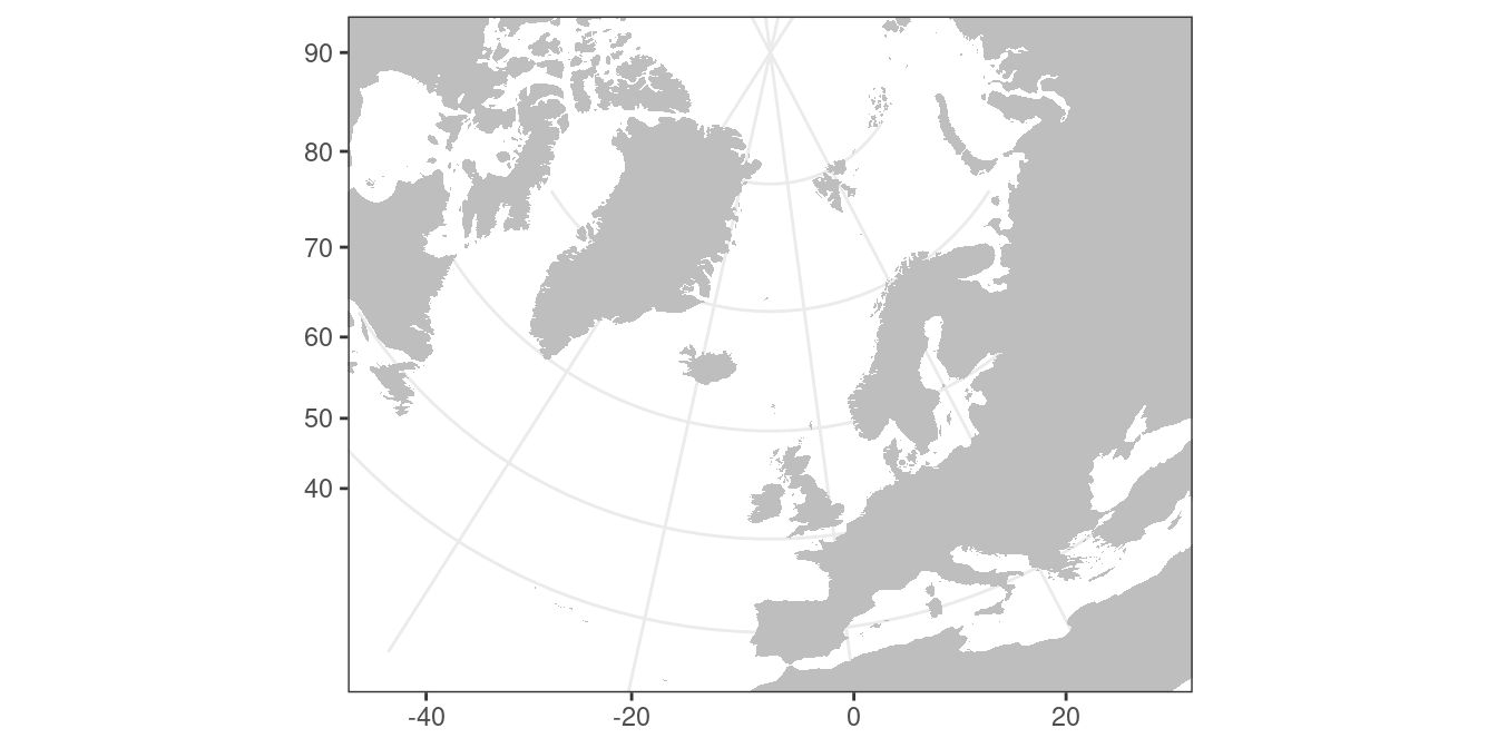
Solution:
map_data("world") %>%
  ggplot(aes(x = long, y = lat, group = group)) +
  theme_bw() +
  geom_polygon(fill = "grey") +
  scale_y_continuous(NULL) +
  scale_x_continuous(NULL) +
  coord_map("ortho", xlim = c(-45,30), ylim = c(35,90))
Overlay data on maps
Now lets plot our minke data over a map:
- First we generate a background map:
m <-
  ggplot() +
  theme_bw() +
  geom_polygon(data = iceland, aes(long, lat, group = group), fill = "grey90") +
  coord_map() +
labs(x = NULL, y = NULL)- Now add the minke data as a layer:
p1 <- m + geom_point(data = w, aes(lon, lat, colour = sex))
p2 <- m +
  geom_point(data = w, aes(lon, lat, size = stomach.weight),
             colour = "red", alpha = 0.25) +
  scale_size_area(max_size = 10)
p1 + p2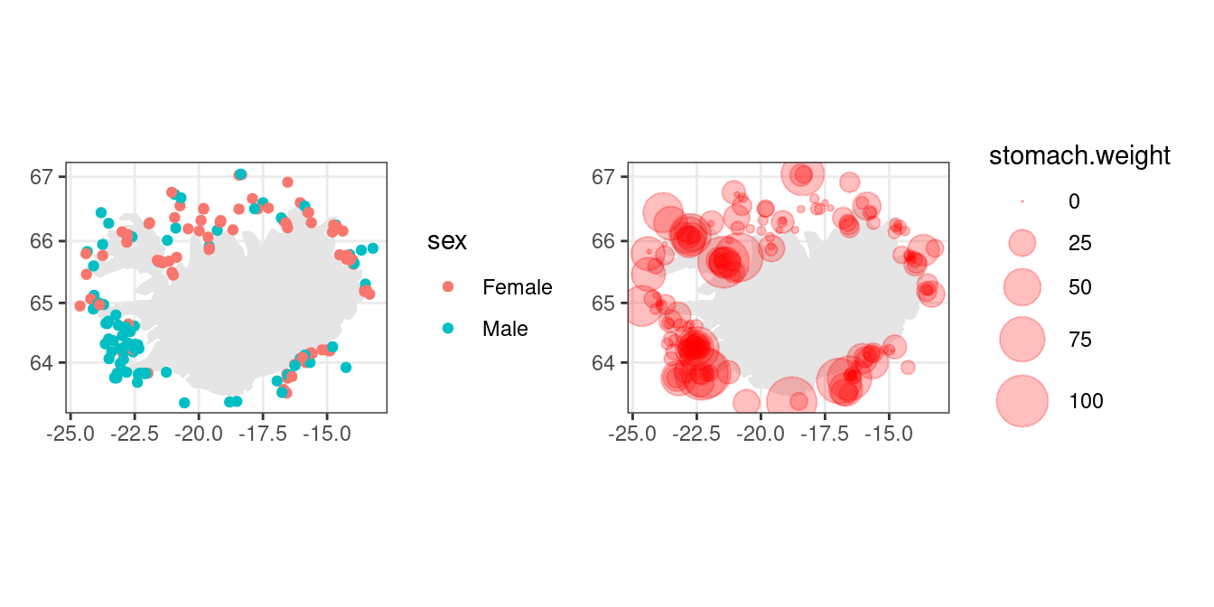
Other background
Depth contours
In oceanography one is often interested in indicating depth. Global relief models from the ETOPO1 dataset hosted on a NOAA server can be accessed using the getNOAA.bathy-function in the marmap-package. To access them one specifies the boundary of the data of interest and then, since we are using ggplot for mapping are turned into a data frame using the fortify-function:
xlim <- c(-28, -10)
ylim <- c(62.5, 67.5)
library(marmap)
depth <-
  getNOAA.bathy(lon1 = xlim[1], lon2 = xlim[2],
                lat1 = ylim[1], lat2 = ylim[2],
                resolution = 1) %>%
  fortify()  # turn the object into a data.frame
glimpse(depth)
Rows: 324,000
Columns: 3
$ x <dbl> -28.00000, -27.98332, -27.96664, -27.94995, -27.93327, -27.91659, -2…
$ y <dbl> 67.5, 67.5, 67.5, 67.5, 67.5, 67.5, 67.5, 67.5, 67.5, 67.5, 67.5, 67…
$ z <dbl> -302.6884, -304.0883, -304.7184, -303.7683, -301.7484, -304.7283, -3…So this data is just a set of x (longitude), y (latitudes) and z (depth). The dataset is a raster-grid which we can visualize by using the geom_raster-function:
depth %>%
  filter(z <= 0) %>%
  ggplot() +
  theme_bw() +
  geom_raster(aes(x, y, fill = z)) +
  coord_quickmap(expand = FALSE)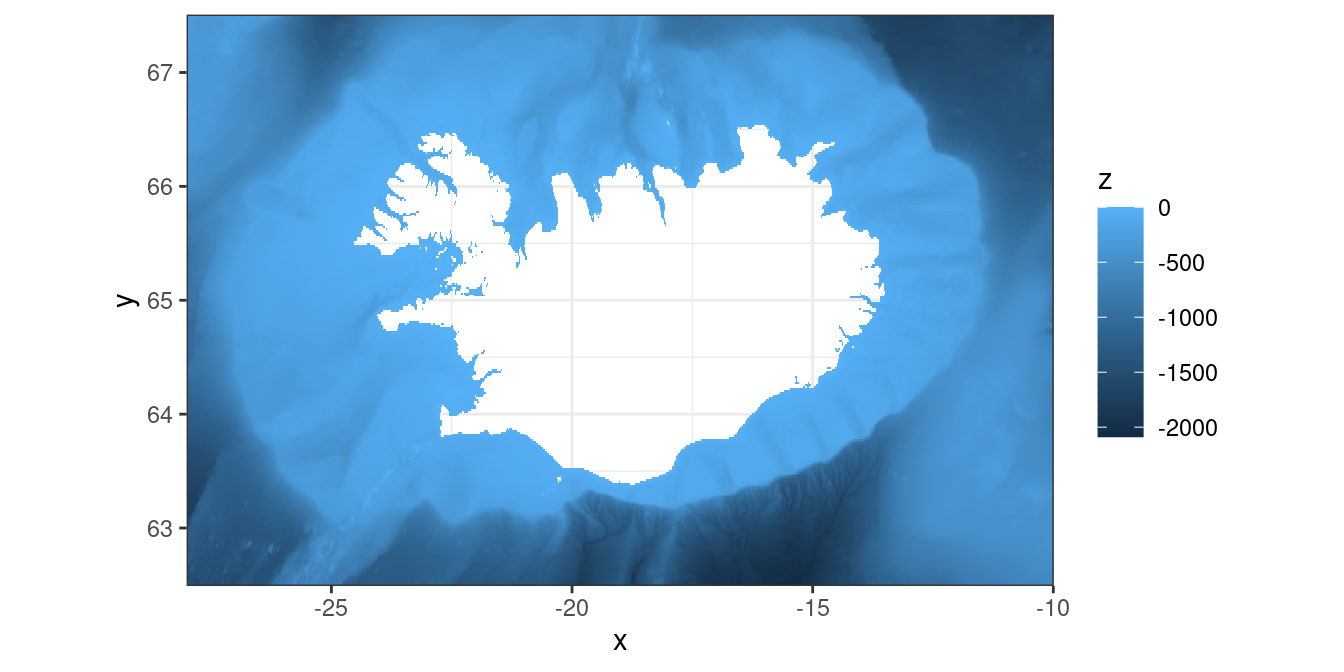
We generate the base map with contours as follows:
m <-
  ggplot() +
  theme_bw() +
  geom_contour(data = depth, aes(x, y, z = z),
               breaks=c(-25, -50, -100, -200, -400),
               colour="black", linewidth = 0.1) +
  geom_polygon(data = iceland, aes(long, lat, group = group), fill = "grey") +
  coord_quickmap(xlim = xlim, ylim = ylim, expand = FALSE) +
  labs(x = NULL, y = NULL)
Lets just look at what we have created:
m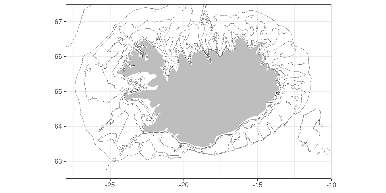
Here we have specified depth contour values of 25, 50, 100, 200 and 400 meters. Now we are ready to add the minke data or any other data of interest:
m + geom_point(data = w, aes(lon, lat), colour = "red")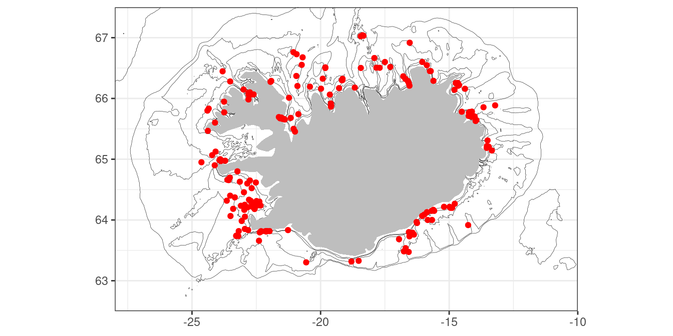
Exercise
Try a plot where the raster image of depth is the background, overlay the contours and then your data.
Solution:
ggplot() +
  theme_void() +
  geom_raster(data = depth,
              aes(x, y, fill = z)) +
  geom_contour(data = depth, aes(x, y, z = z),
               breaks=c(-25, -50, -100, -200, -400),
               colour="white", linewidth = 0.1) +
  geom_polygon(data = iceland, aes(long, lat, group = group), fill = "grey") +
  geom_point(data = w, aes(lon, lat), colour = "red", size = 0.5) +
  coord_quickmap(xlim = xlim, ylim = ylim, expand = FALSE) +
  labs(x = NULL, y = NULL) +
  theme(legend.position = "none")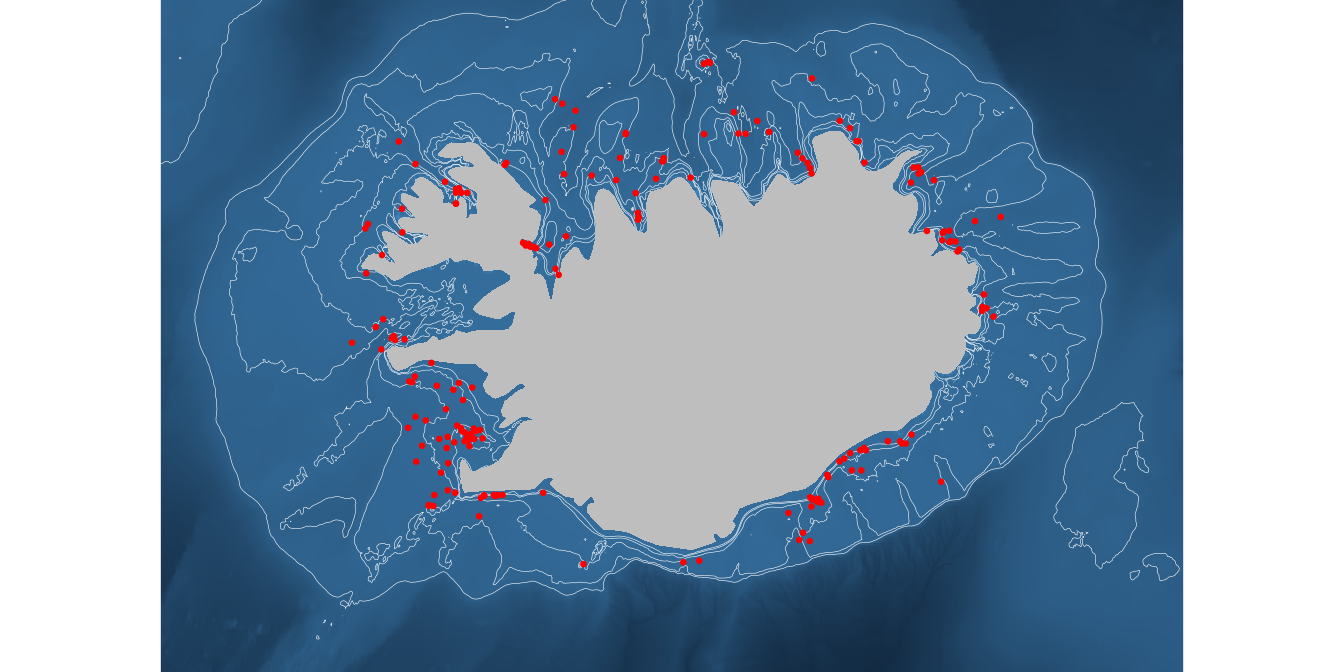
Although the image may look “sexy”, think about the main message your are trying to convey to the recipient of such a plot.
Gridding data
Let’s use the survey data as an example
station <-
  read_csv("https://heima.hafro.is/~einarhj/data/is_smb_stations.csv")
biological <-
  read_csv("https://heima.hafro.is/~einarhj/data/is_smb_biological.csv")
Sidepoint
You can generate the tow-tracks via the geom_segment function:
station |>
  filter(year == 2010) |>
  ggplot() +
  geom_segment(aes(x = lon1,
                   y = lat1,
                   xend = lon2,
                   yend = lat2)) +
  coord_quickmap(xlim = c(-28, -20), ylim = c(65, 67.5))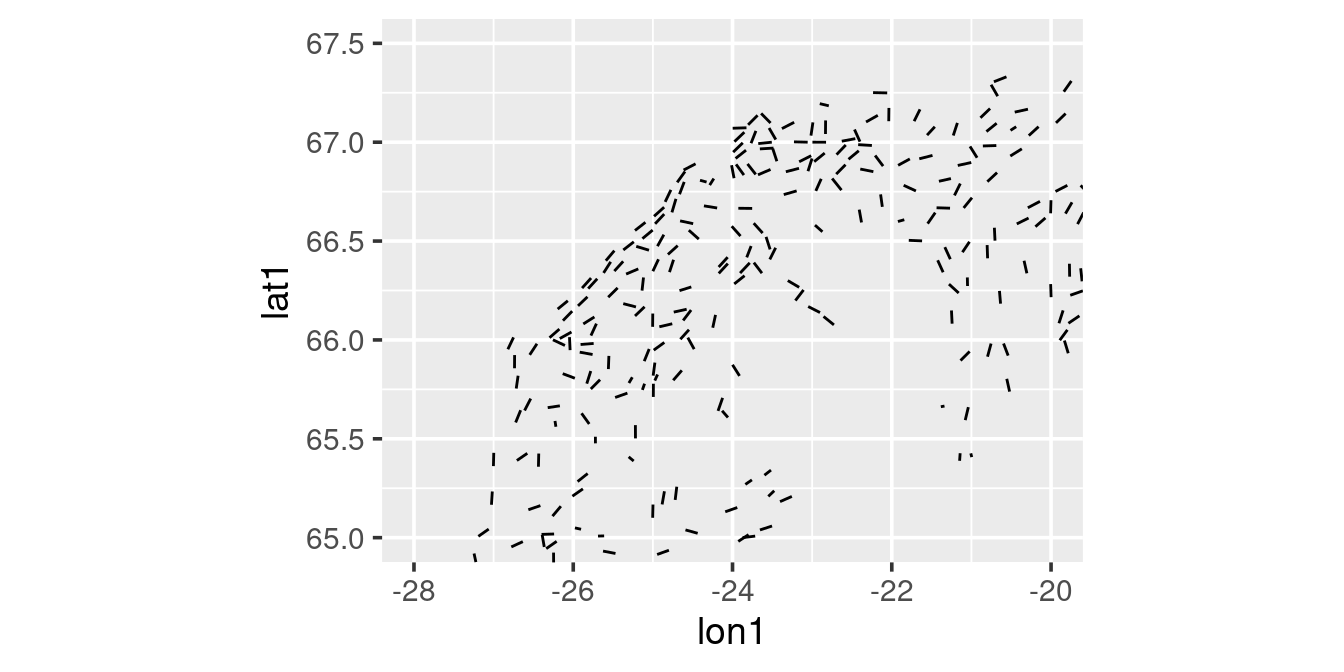
For the gridding, let’s use a homemade gridding function:
#' grade
#'
#' @param x A numerical vector to set on a grid
#' @param dx The resolution (NOTE: not tested for values greater than 1)
#'
#' @return A vector of grid midpoint values

grade <- function(x, dx) {

  if(dx > 1) warning("Not tested for grids larger than one")
  brks <- seq(floor(min(x)), ceiling(max(x)),dx)
  ints <- findInterval(x, brks, all.inside = TRUE)
  x <- (brks[ints] + brks[ints + 1]) / 2
  return(x)
}
For more information see e.g. On gridding spatial data
We can e.g. get the number of tows taken by statistical rectangle (1 degree longitude, 0.5 degree latitude) in one year by:
station.grid <-
  station |>
  filter(year == 2010) |>
  select(id, year, lon1, lat1) |>
  mutate(long = grade(lon1, 1),
         latg = grade(lat1, 0.5))
station.grid |> glimpse()
Rows: 594
Columns: 6
$ id <dbl> 345249, 345250, 345251, 345252, 345253, 345254, 345255, 345256, 3…
$ year <dbl> 2010, 2010, 2010, 2010, 2010, 2010, 2010, 2010, 2010, 2010, 2010,…
$ lon1 <dbl> -11.23550, -11.00033, -10.91217, -10.63017, -11.05333, -11.20483,…
$ lat1 <dbl> 63.41867, 63.55200, 63.87250, 64.10400, 64.25183, 64.30600, 64.30…
$ long <dbl> -11.5, -11.5, -10.5, -10.5, -11.5, -11.5, -11.5, -11.5, -12.5, -1…
$ latg <dbl> 63.25, 63.75, 63.75, 64.25, 64.25, 64.25, 64.25, 64.25, 64.75, 64…Let’s just do a simple count of tows by statistical rectangle and plot the results:
station.grid |>
  count(long, latg) |>
  ggplot(aes(long, latg)) +
  geom_tile(aes(fill = n)) +
  geom_text(aes(label = n), colour = "red", angle = 45) +
  coord_quickmap()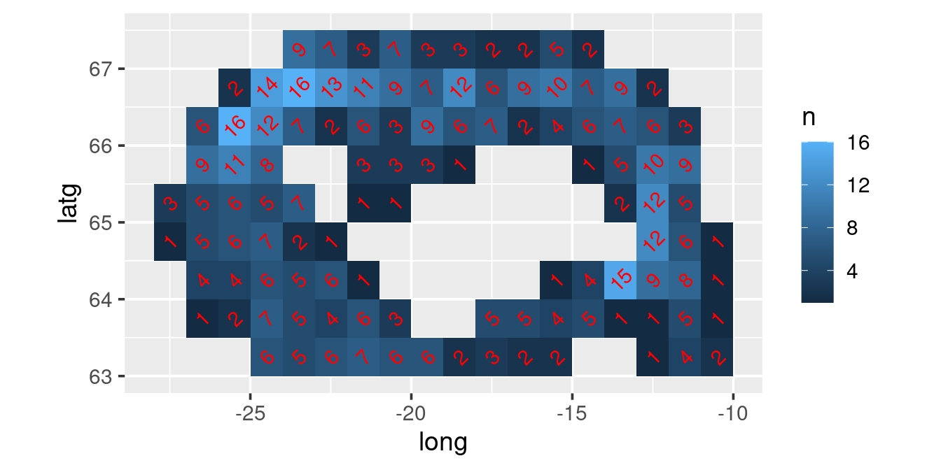
Exercise
I want a map of the catch of e.g. cod for some years by statistical rectangle
Discuss conceptually the coding steps needed
Solution:
- The coordinates are in the station table but the cod catches are in the biological table. Hence we first need to join the two tables.
- We need to grid the data to the specified resolution (1 degree longitude, 0.5 degree latitude). Use the grade function.
- We need to take the mean of the catches of the station within each rectangle. So use the group_by and summarise functions
- We want finally to plot the data using ggplot
station |>
  filter(year == 2010) |>
  select(id, year, lon1, lat1) |>
  left_join(biological |>
              filter(species == "cod")) |>
  # in the biological table catch is not reported for species if species not caught.
  #  In the so we have NA in kg for those tows, here we explicitly put those as zero
  mutate(kg = replace_na(kg, 0),
         lon = grade(lon1, 1),
         lat = grade(lat1, 0.5)) |>
  group_by(lon, lat) |>
  summarise(kg = mean(kg)) |>
  ggplot(aes(lon, lat)) +
  geom_tile(aes(fill = kg)) +
  geom_point(data = station |> filter(year == 2010),
             aes(lon1, lat1), colour = "red", size = 0.5) +
  coord_quickmap()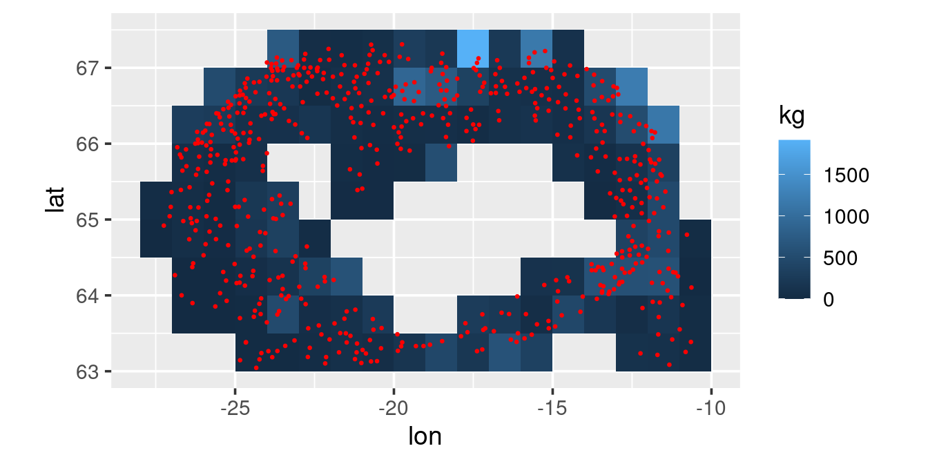
Asked in class: “How do you make this plot pretty?”
One trial:
station |>
  filter(year == 2010) |>
  select(id, year, lon1, lat1) |>
  left_join(biological |>
              filter(species == "cod")) |>
  # in the biological table catch is not reported for species if species not caught.
  #  In the so we have NA in kg for those tows, here we explicitly put those as zero
  mutate(kg = replace_na(kg, 0)) |>
  mutate(lon = grade(lon1, 1),
         lat = grade(lat1, 0.5)) |>
  group_by(lon, lat) |>
  reframe(kg = mean(kg)) |>
  # here we change a continous variable to descrete varable by "binning" the data
  #  Since the distribution of the catch per tow is lognormal we use unequal bins
  #  The specific bins below mean that we roughly similar number of statistical rectangles
  #  within each interval
  mutate(kg = cut(kg, breaks = c(0, 25, 50, 75, 100, 200, 400, Inf), include.lowest = TRUE)) |>
  ggplot(aes(lon, lat)) +
  theme_bw() +
  # add little transparency to make the colours a bit softer
  geom_tile(aes(fill = kg), alpha = 0.8) +
  geom_segment(data = station |> filter(year == 2010),
               aes(x = lon1, y = lat1,
                   xend = lon2, yend = lat2),
               linewidth = 0.5,
               colour = "grey") +
  geom_polygon(data = iceland,
               aes(long, lat),
               fill = "grey") +
  coord_quickmap() +
  # direction = -1 means that yellow is small catch, black is big catch
  scale_fill_viridis_d(option = "inferno", direction = -1) +
  # plot grid lines the same as how the data was graded
  scale_x_continuous(breaks = seq(-30, 0, by = 1)) +
  scale_y_continuous(breaks = seq(62, 68, by = 0.5)) +
  # the \n in the fill below means "new line"
  labs(x = NULL, y = NULL, fill = "Cod\n[kg/tow]")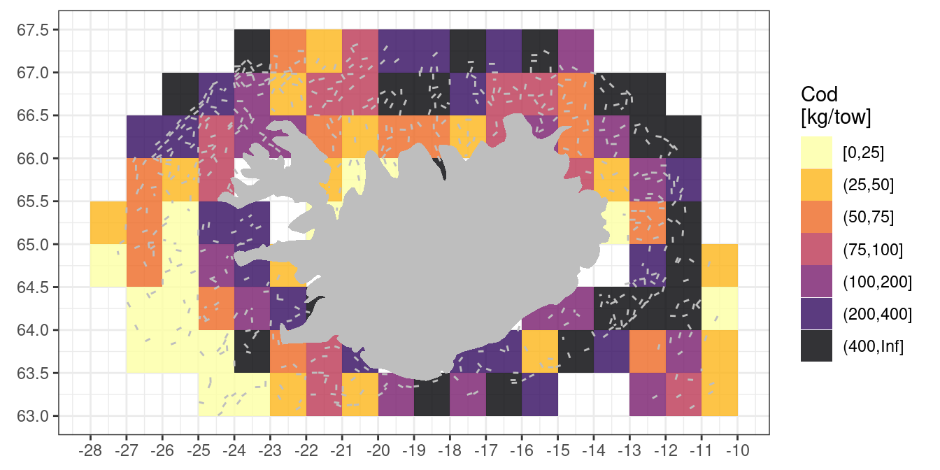
Quick bit
my_country <- map_data("world", region = "Cuba")
my_country |> glimpse()
Rows: 305
Columns: 6
$ long <dbl> -82.56177, -82.65484, -82.85317, -82.95962, -83.06728, -83.1…
$ lat <dbl> 21.57168, 21.51865, 21.44390, 21.44131, 21.46939, 21.53189, …
$ group <dbl> 1, 1, 1, 1, 1, 1, 1, 1, 1, 1, 1, 1, 1, 1, 1, 1, 1, 1, 1, 1, …
$ order <int> 1, 2, 3, 4, 5, 6, 7, 8, 9, 10, 11, 12, 13, 14, 15, 16, 17, 1…
$ region <chr> "Cuba", "Cuba", "Cuba", "Cuba", "Cuba", "Cuba", "Cuba", "Cub…
$ subregion <chr> "Isla de la Juventura", "Isla de la Juventura", "Isla de la …my_country |> count(group, subregion) group subregion n
1 1 Isla de la Juventura 21
2 2 Cayo Sabinal 12
3 3 Cayo Guajaba 12
4 4 Cayo Romano 12
5 5 Cayo Coco 14
6 6 Caya Fragosa 8
7 7 <NA> 226p <-
ggplot() +
geom_polygon(data = my_country,
aes(x = long, y = lat, group = subregion),
fill = "grey") +
labs(x = NULL, y = NULL)
p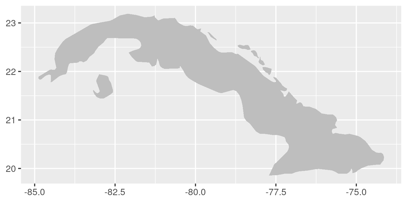
# "fix" the aspect ration
p1 <- p + coord_quickmap()
p1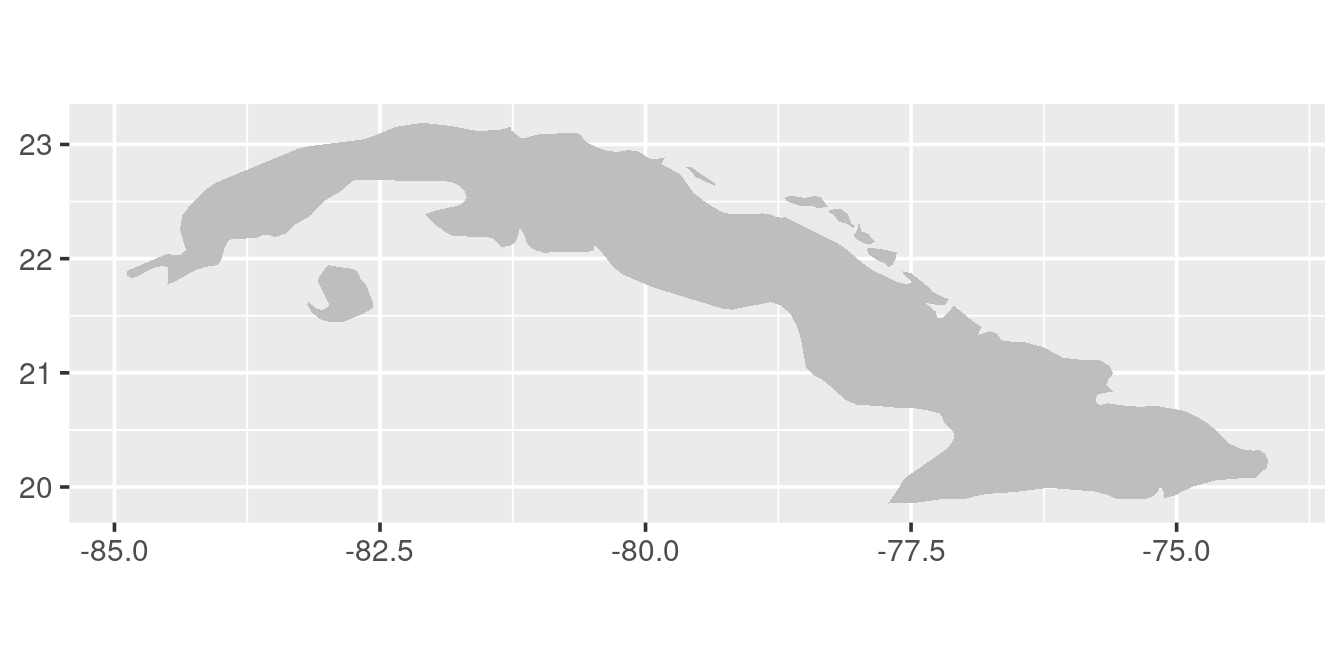
# add some data to map
p1 +
  geom_point(aes(x = -80, y = 21.75), colour = "red", size = 10)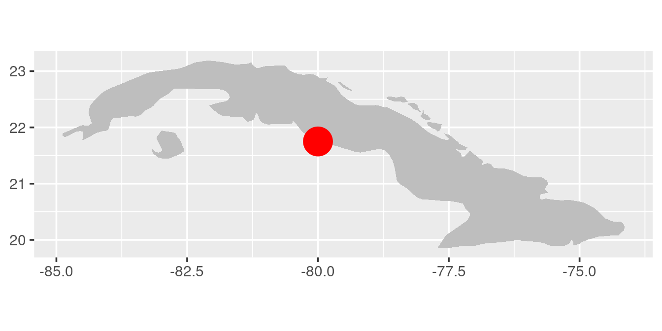
# limit the area plotted
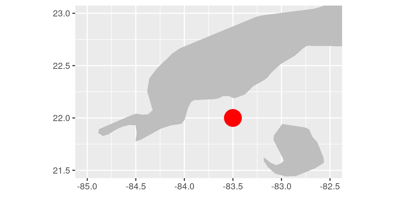
p1 +
coord_quickmap(xlim = c(-85, -82.5), ylim = c(21.5, 23)) +
geom_point(aes(x = -83.5, y = 22), colour = "red", size = 10)